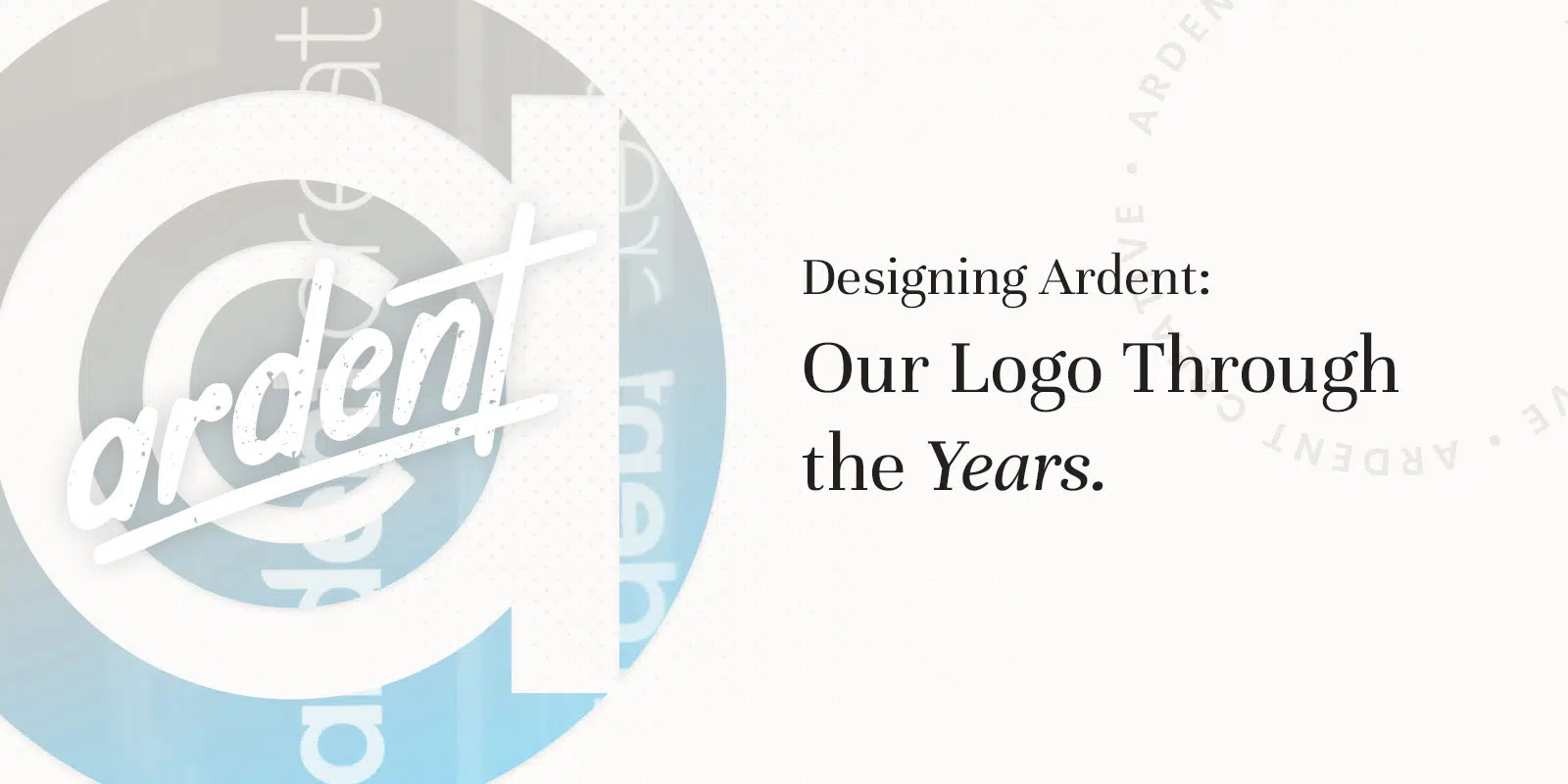
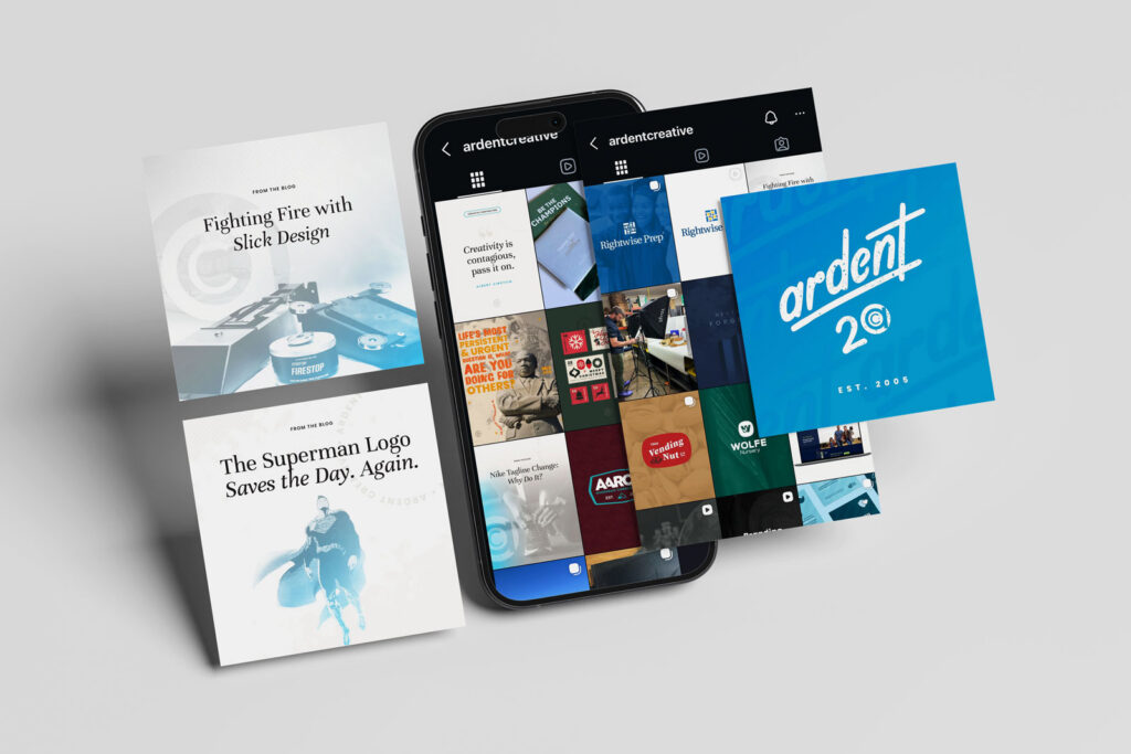
Here’s something we don’t talk about too much — the story behind our own logo. For a logo design agency, we should be tooting our own horn more than we do, but we're way too busy making our clients' work look amazing to talk about our own. Ardent Creative’s brand has changed over the years, and each version tells the story of where we were as a company and where we were headed. Let’s look at each stage in all of its glorious details.
2003 - 2004 - Just Starting Out
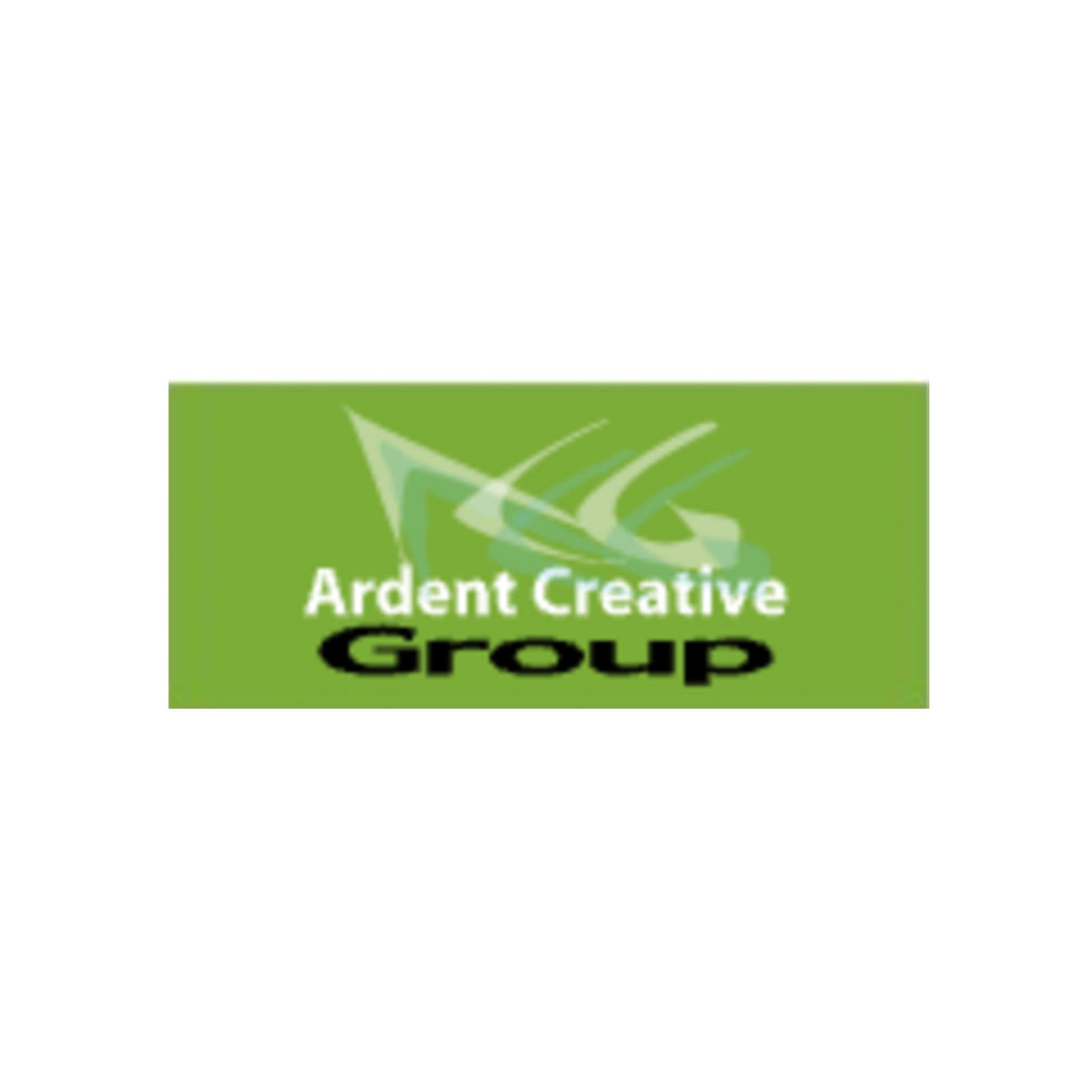
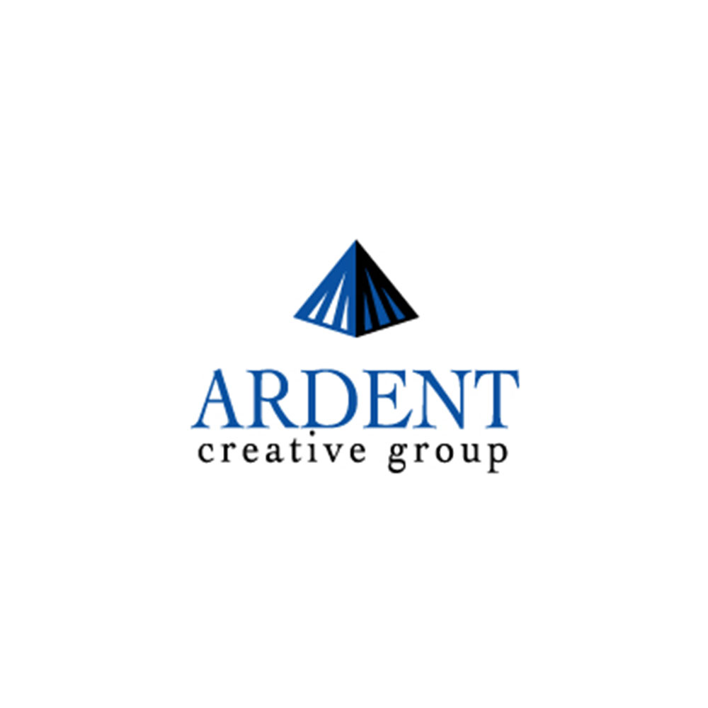
Before Brad and David teamed up, the agency went by Ardent Creative Group — David’s one-man show. David whipped up the squiggle logo, full of energy, creativity, and movement, while Brad crafted the pyramid logo, all about strength and stability. Back then, it was a little “what feels right” and a lot of instinct. Since those early days, we’ve learned how to design with real purpose — turning logos and brand visuals into stories that stick and results that matter.
2005 - Our Agency Takes Shape
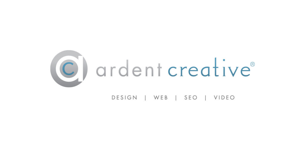
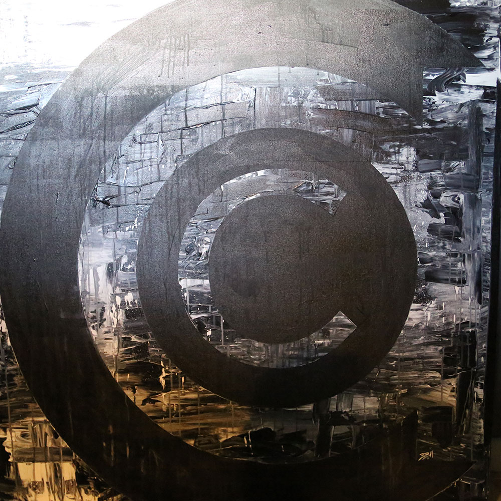
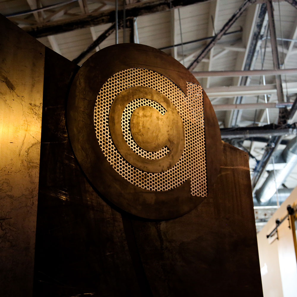
Everything changed once the team was formed and a true agency was born. Gone were the random shapes. Hello clean lines, professional typeface, and an actual icon that tied to our name. We were intentional in our design and it showed. The concentric circles forming a 'C' was a nod toward the copyright symbol and the minimalism design trend of the era. We finally had a cohesive look that said "we know what we're doing" instead of "we just like this shape." Progress!
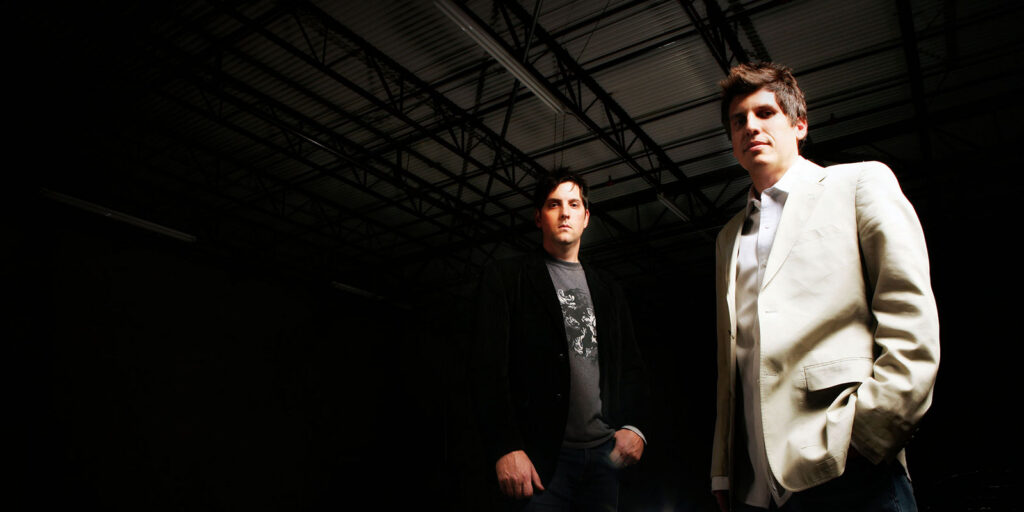
2008 - Not a Logo But Our Vibe
Okay, so this isn't a logo update, but we can't talk about our brand history without dropping these gems. That dramatic lighting, industrial setting, and "we're brooding artists with a vision" posing was absolutely everywhere in the mid-to-late 2000s. It was the era of taking your band photos very, very seriously. Looking back, these photos capture something important — Brad and David were two young kids who weren't afraid to put themselves out there for the success of the agency, even if that meant these photos would come back to haunt them in our group chats.
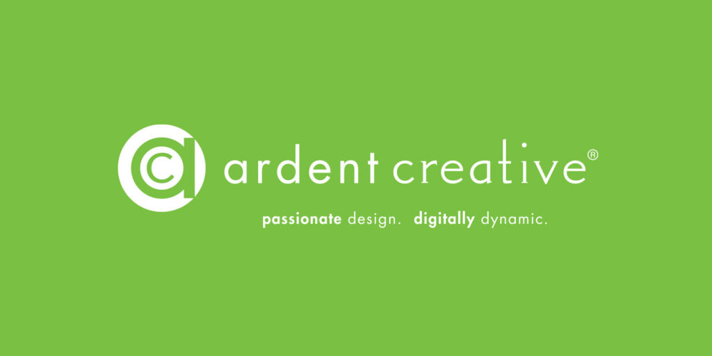
2010-2012 - Going Green
The logo got its first update to be horizontal and we added a service list-style tagline below it. By 2012, we went bolder with a bright green and dropped the previous tagline for "Passionate Design. Digitally Dynamic." The horizontal layout also gave us more flexibility — it fit better on websites, email signatures, and all those places a stacked logo just wouldn't work. Small changes, but they made the brand feel more confident and intentional.
2014 - Taking Over Funky Town
Another agency, Concept Culture, and Ardent merged, and suddenly we had a more focused creative team ready to dominate the region. The logo went full green and impossible to miss. We weren't playing small anymore. We moved into a new office in the heart of Funky Town, and the message was clear: we were here to be Fort Worth's go-to marketing agency. The rebrand wasn't just about looking good — it was about showing we had the team and the killer ideas to compete for the best work in the region.
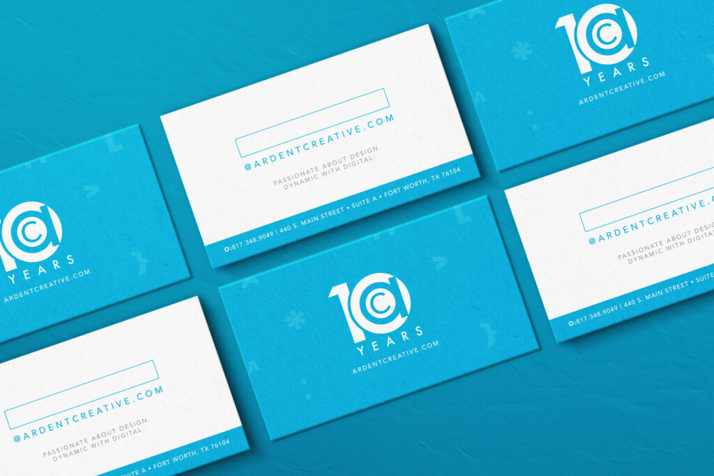
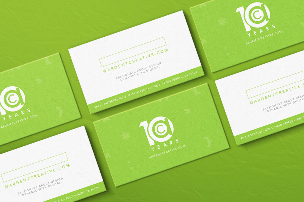
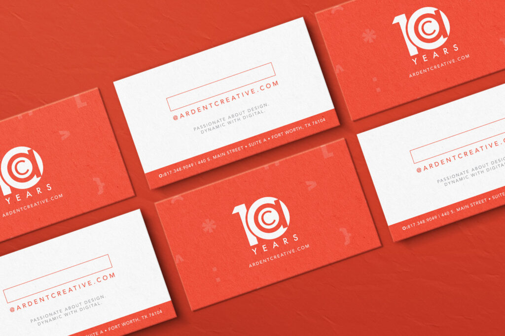
2015 - Ten Years In
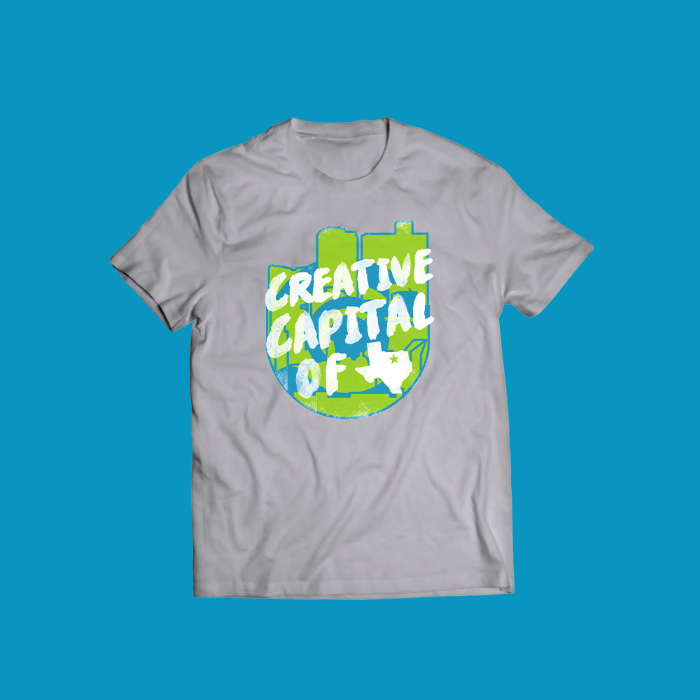
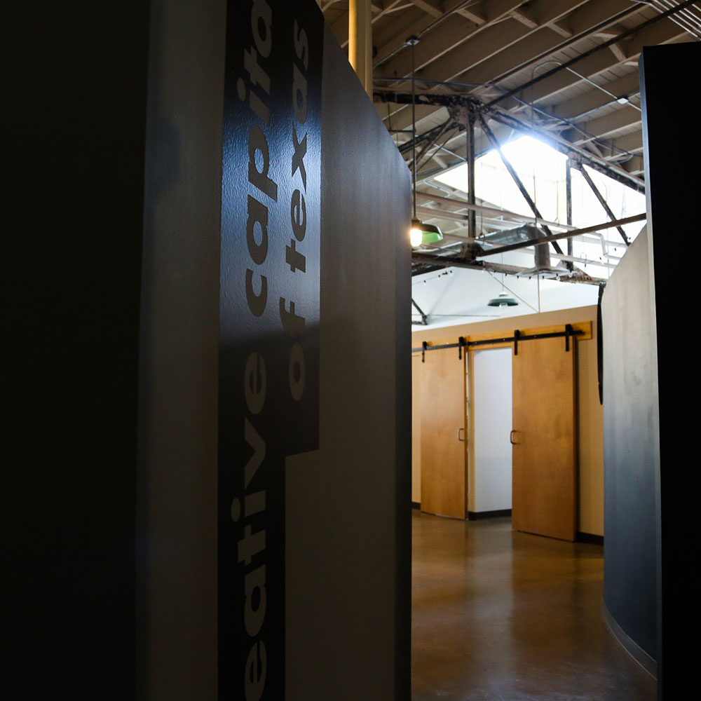
2015 was our big Ten Year party, and man were we having fun. We used bold typefaces, lots of color, and quirky sayings to showcase our culture. This is when we also introduced a tagline that would define us: "Creative Capital of Texas." It wasn't just a catchy phrase — it was a declaration. We put this on t-shirts, swag, everywhere we could, and it became our identity from here on out. We weren't just another agency in Fort Worth — we were staking our claim as the creative hub of Texas.
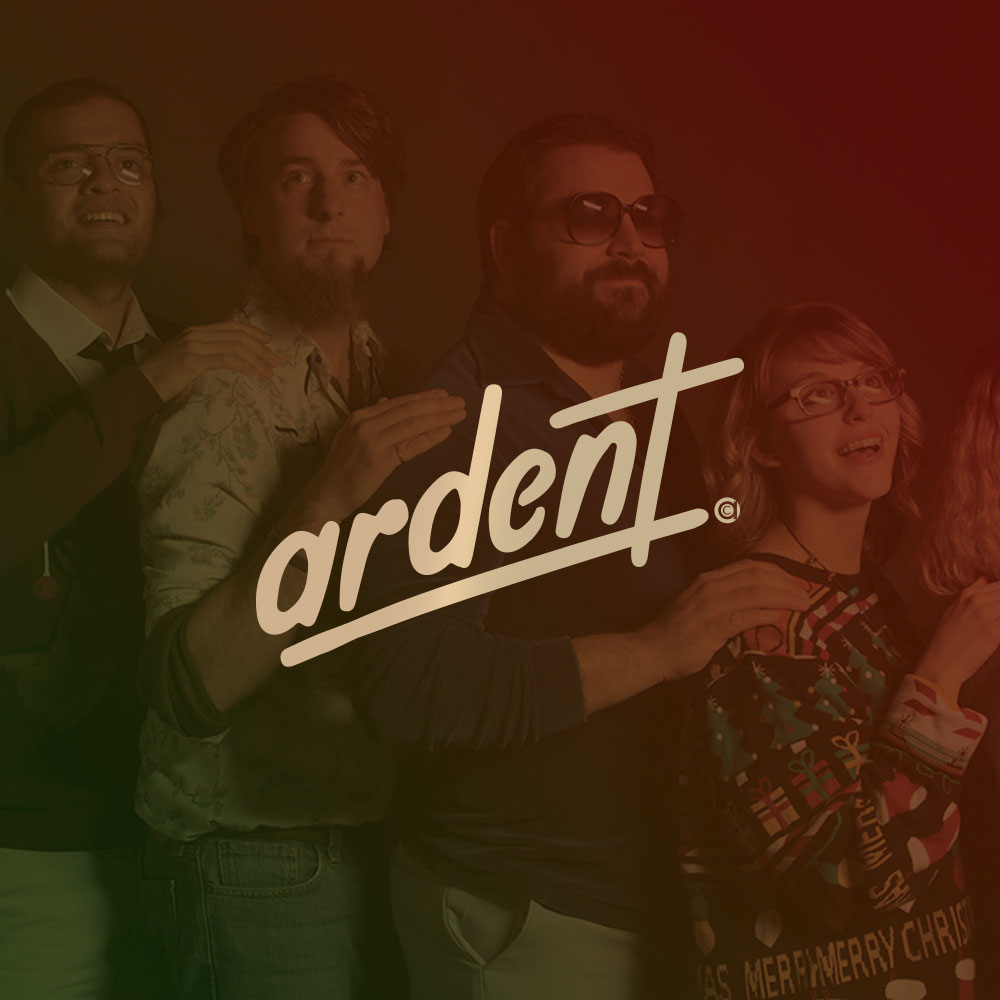
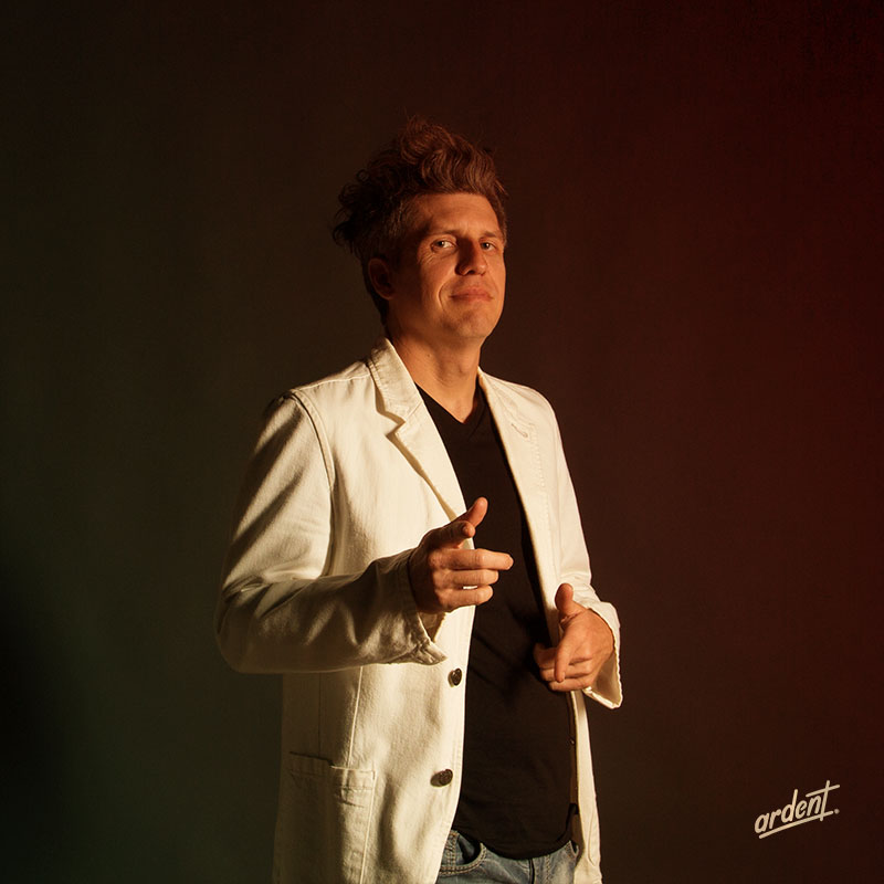
At the end of the year we did a fun Christmas campaign inspired by Olan Mills photos. For the shoot, we redid the Ardent logo in that classic script type to put at the bottom of the images we took. And just like that, a holiday gag became a team-favorite actual logo that would show up even today.
2016 - Making Our Mark
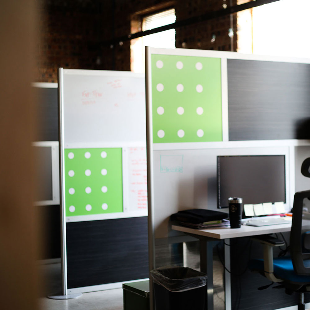
This was a huge year of growth for our company. We had a ton of new hires and quickly outgrew the current office. With all the newbies came a booming company culture, so it felt like time for us to leave a defining mark on our brand.
In 2016 we signed a lease for a new office that we'd move into in early 2017. We spent the year rebranding our logo to launch us into our next chapter. We changed the typeface of Ardent Creative to be bolder and sleeker but kept the bug (that's designer speak for the icon) as is. We wanted to make sure it really fit the aesthetic of the new office and would work better on signage, too.
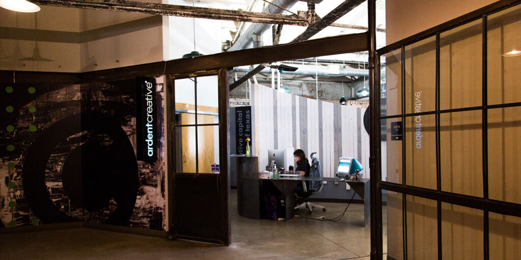
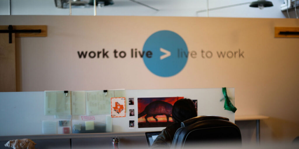
2017 - The Office as Brand Statement
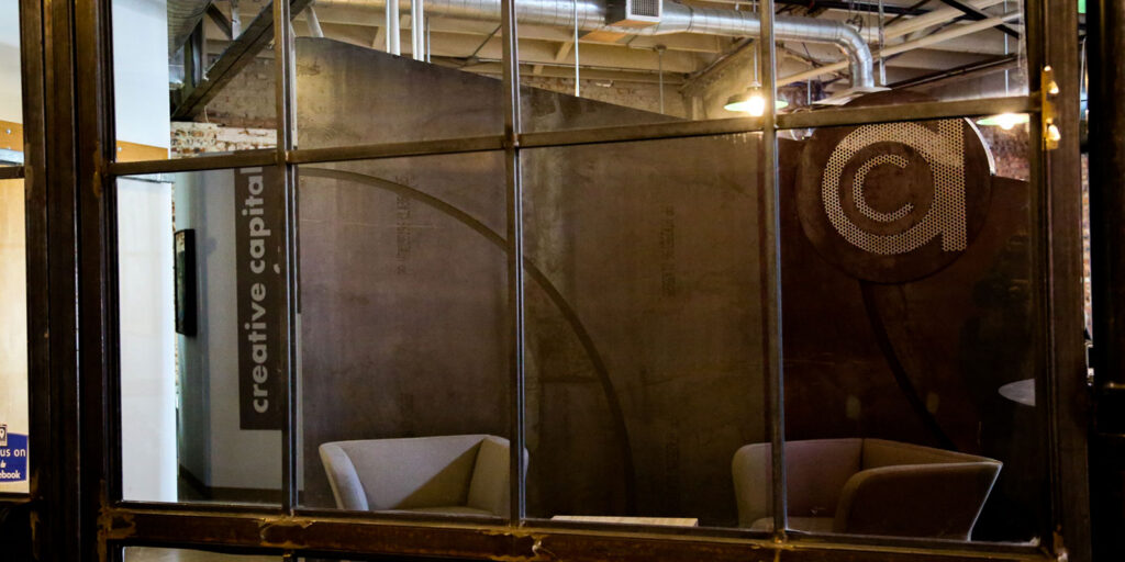
The year of the new office brought a major branding opportunity. Brad painted a version of the Ardent icon for the entrance wall, and its monotone color scheme set the tone for the entire space: primarily black with hints of white, gray, blue, and green. The office aesthetic pushed our brand in the same direction, and the website got a full rebrand to match our new standards. But the new space wasn't just about aesthetics — it reflected our brand values, right down to the "work to live > live to work" mantra on the wall. Everything about this move was intentional, from the paint colors to the messaging. We were showing clients (and ourselves) who we'd become.
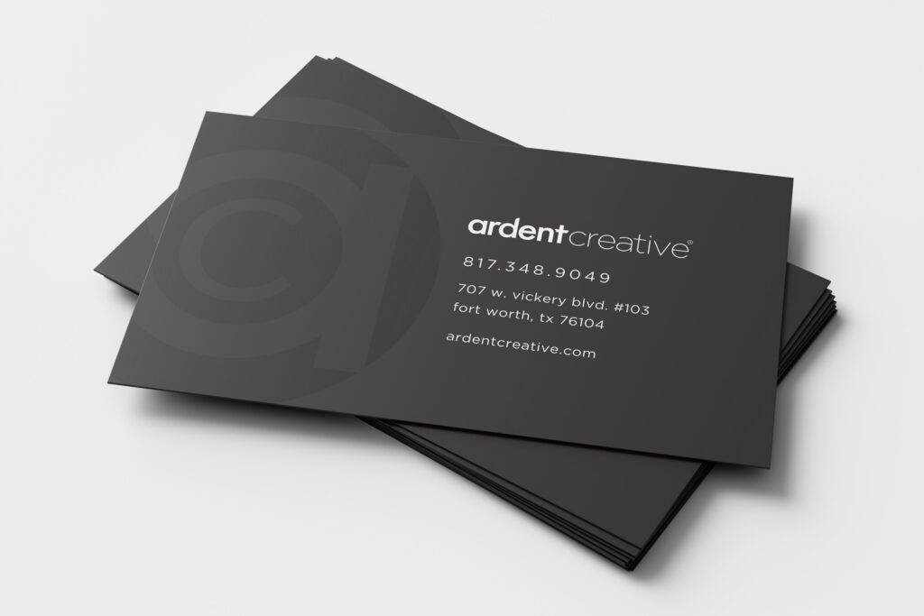
2018 - 2019 - Back in Black
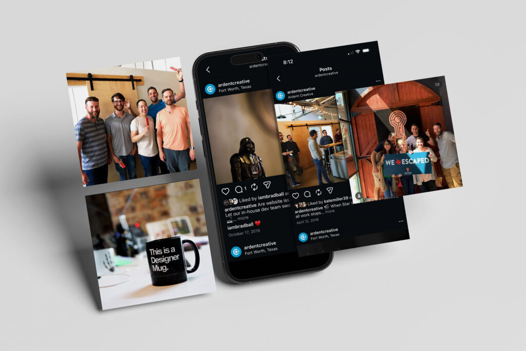
We started moving toward a cleaner, more minimal look. First, the executive cards went all black. Then in 2019, we went all in — every business card became simple, all black with a varnish. We even updated the office, toning down some of the brightness and switching out walls to be black and more subtle. The brand was getting quieter visually, but our focus on culture got louder. We made sure our team was front and center throughout the website and on social media. We wanted to show people who we were and what it would be like working with us — not just what our logo looked like.https://eqtzznyadytvenpvxkir.supabase.co/storage/v1/object/public/site-images/wp-migrate/2026/02/AC-Site-Scroll-2021-Large.mov
2021 - Website Overhaul
We had been tweaking the website every year since our big rebrand of 2017, but in 2021 we overhauled the homepage. This update took some of the boldness out of the type and let the color shine through on the projects. We focused on the simplicity of our brand and put the client work front and center. A big reason for this shift? We were no longer in the office. Culture wasn't as visible and connection was harder. We couldn't do photoshoots together or capture culture events like we used to, but we were proud of the work we were producing and wanted that to shine.
2022 - 2023 - Consistency Mode
Dark backgrounds with bright white type, all lowercase, hints of blue on all social posts and collateral. Clean, dark photos. Bright type. Nothing distracting or clunky. We had found our formula and stuck to it.
2024 - Bringing Back Personality
We looked at our brand and realized we'd lost some personality. This year we introduced a secondary typeface that was friendlier and lighter, and brought back color and brightness to our social media. It was an intentional step to break out of the consistency that had worked for us for so long but lacked spark.https://eqtzznyadytvenpvxkir.supabase.co/storage/v1/object/public/site-images/wp-migrate/2026/02/AC-Ardent-Logo-Animation-1.mp4
2025 - That Script Makes a Comeback
As we worked on bringing back our personality, the 2015 Olan Mills script typeface made a subtle comeback. We put it on our website and on some swag items, but when it was time to highlight our 20th year, this was the logo that made us feel most like us. As the year came to a close, we all noticed the script type was becoming the primary logo without us even trying.
2026 - What's Next
This is the year we're shaking things up. We're taking more risks with our brand, leaning into what feels right instead of what's "safe," and letting our personality lead the way. The script logo is sticking around, but who knows what else we'll try. After 20 years, we're not slowing down — we're just getting started. Stay tuned.
Like What You See?
If our style resonates with you, imagine what we could do for your brand. Whether you're just starting out or ready for a refresh, we'd love to help shape your identity. Let's talk about where your brand is headed. Reach Out