If you’ve ever talked to a high school kid about college prep, you know the mix of excitement and panic that comes with it. Between SAT scores, essays and endless deadlines, it’s easy to feel overwhelmed. Rightwise Prep was built to change that with college readiness programs that feel achievable and approachable, and maybe even dare we say it — a little fun.
When the Rightwise team reached out to Ardent Creative, they were ready for a full rebrand. Their old look and name didn’t match the heart behind what they do. They wanted something that felt friendlier to the students and families they serve. Our job? To give them a brand that felt confident, supportive and easy to connect with — like that favorite teacher who makes even the hardest class feel doable.
Building a Friendlier Identity
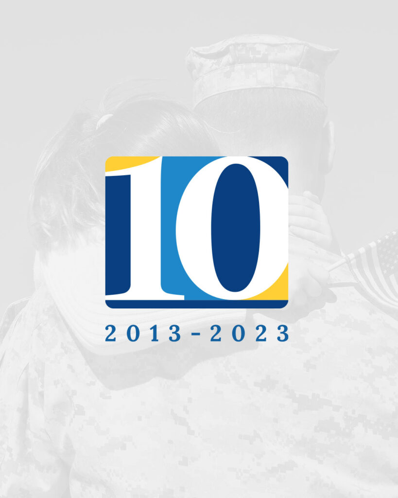
We kicked things off with the logo. The new mark uses clean, structured geometry that gives it a sense of order and intelligence, but we softened it with rounded edges and approachable shapes. It’s smart without being stiff.
Next came color. Instead of sticking to the traditional academic palette (you know, the navy and gray every education brand seems to use), we brought in bright colors and shapes that feel lively.The idea was simple: when students land on the site, it should feel like a place that believes in them.
Putting the Brand to the Test
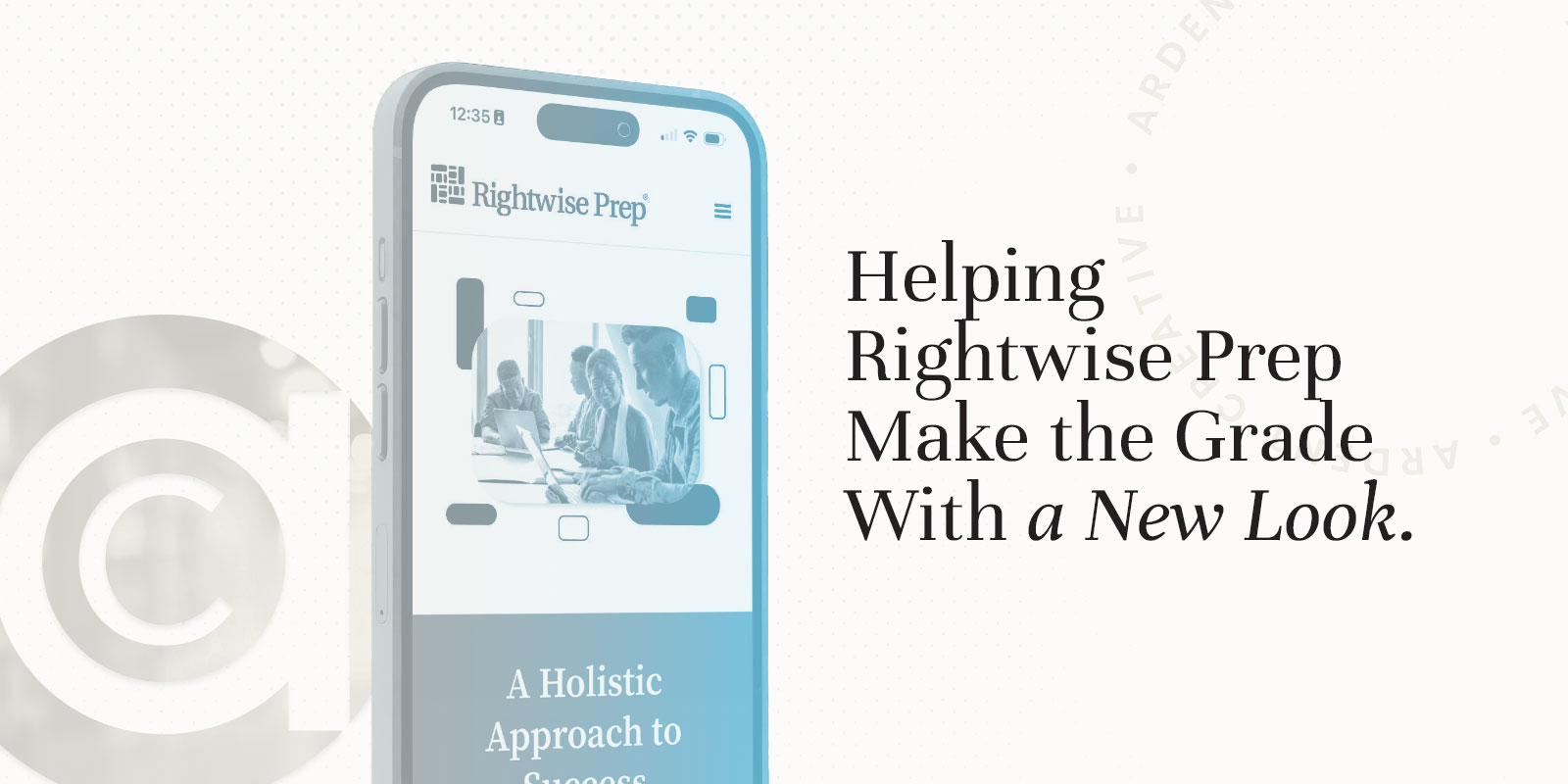
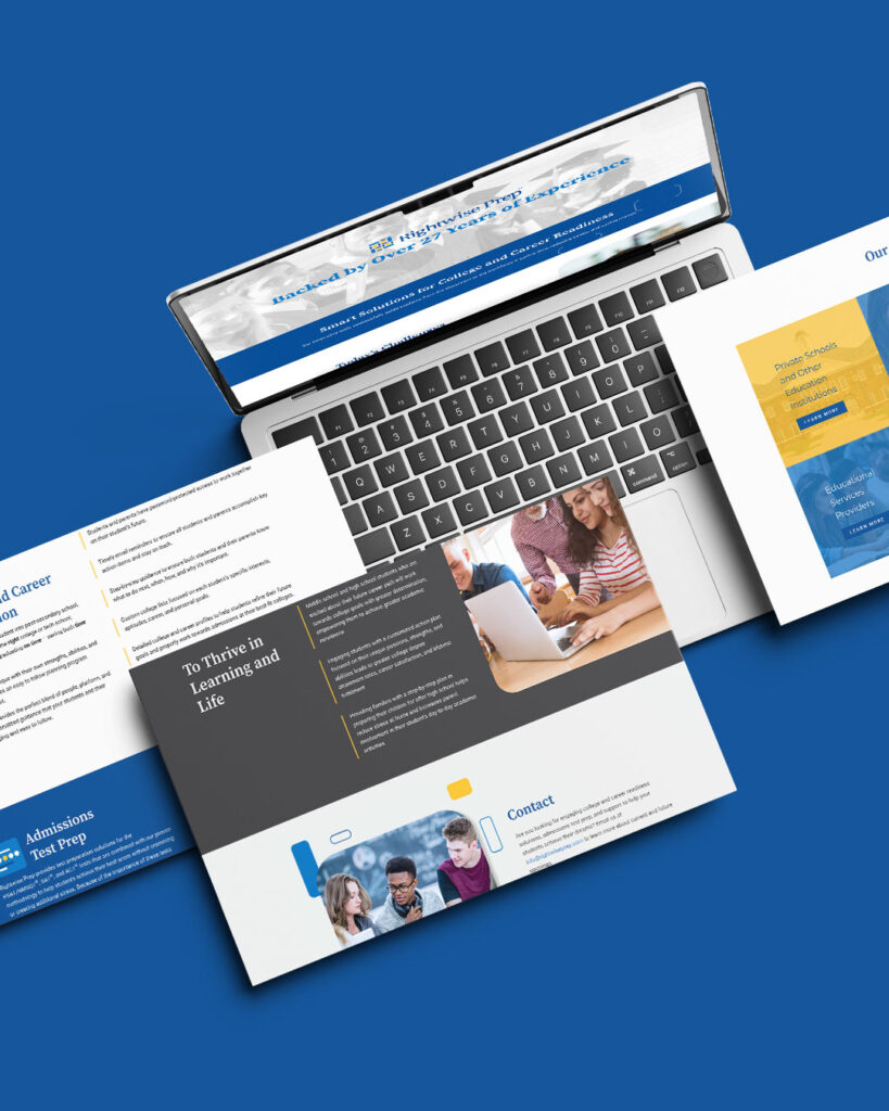
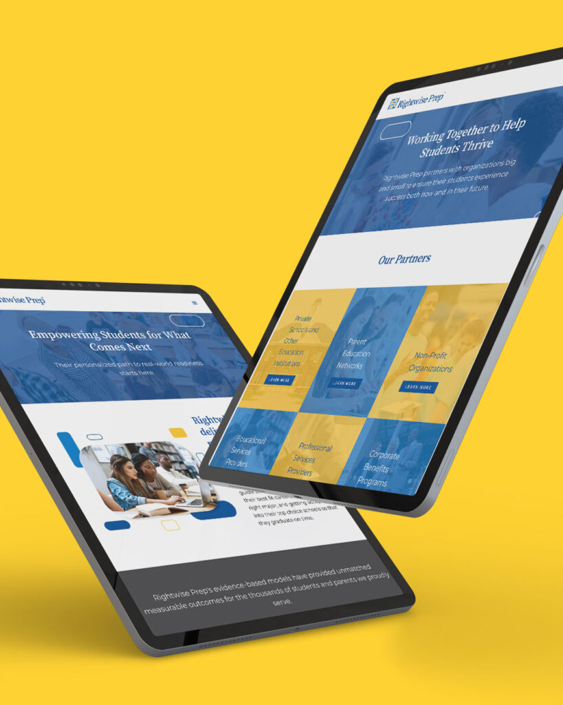
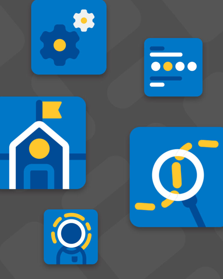
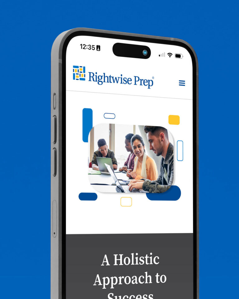
Once the look and feel were locked in, we moved on to the website. The new site is designed to make life easier for both students and parents, with clear navigation paths for everything from SAT and ACT prep to career readiness tools. We built custom icons and illustrations to bring some personality into the mix and made sure the design flowed naturally with the end user in mind.
Everything about the new digital identity was created with one goal in mind: to help visitors feel confident, not confused. Whether they’re looking for tutoring help or college planning tips, the new Rightwise Prep site leads them there without all the fuss.
Consistency Makes the Grade
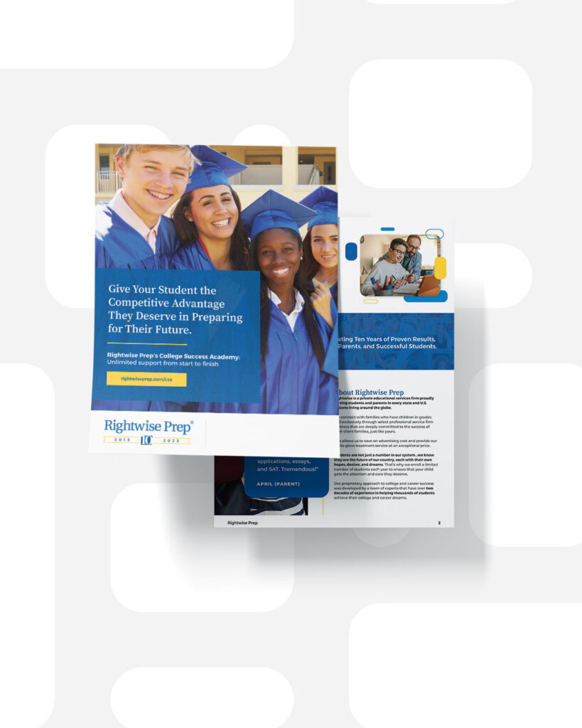
The Rightwise Prep brand extends beyond just digital. Whoever said print is dead doesn’t realize people still use paper every day. Brochures, flyers and handouts were redesigned to match the logo, colors, and friendly tone, ensuring a consistent experience for students and families at every touchpoint.
A Brand That Believes in Students
For Rightwise, this project was never just about a logo or a website. It was about creating a visual identity that reflects who they really are — a team of educators and mentors who want to see students succeed.
Now, with a look that feels smart and friendly, Rightwise Prep is showing up in the world exactly as they should: confident, capable and ready to help the next generation take on the world.