Our Community-Our Kids

Strategy + Design + Web + Print

Our Community-Our Kids case study - Ardent Creative

Logo and Branding

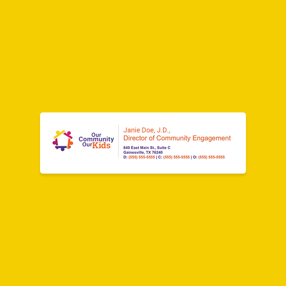
The new OCOK logo captures the spirit of its mission with vibrant colors and playful elements that symbolize youth and connection. Designed to resonate with kids and families, this modernized logo tells their story at every glance with versatile formats.

Branding - Logo Update

Our Community-Our Kids – Branding - Logo Update image 1 Our Community-Our Kids – Branding - Logo Update image 2 Our Community-Our Kids – Branding - Logo Update image 3

Branding - Logo Update

Our Community-Our Kids – Branding - Logo Update image 1 Our Community-Our Kids – Branding - Logo Update image 2

Website and Digital Presence

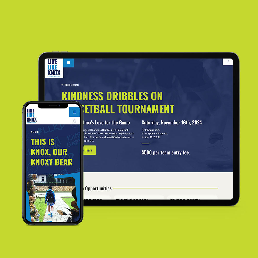
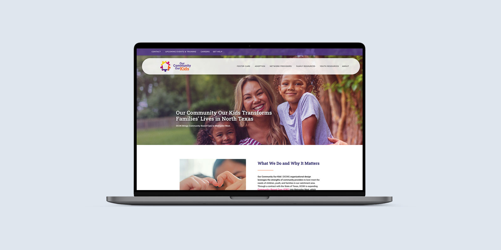
A compelling brand deserves an equally impactful online presence. We redesigned OCOK’s website to seamlessly integrate their updated visuals and message, making it easier than ever to connect with their audience.

Email Signature / Business Card

Our Community-Our Kids – Email Signature / Business Card image 1 Our Community-Our Kids – Email Signature / Business Card image 2

Website Design

Our Community-Our Kids – Website Design image 1

Swag with Purpose

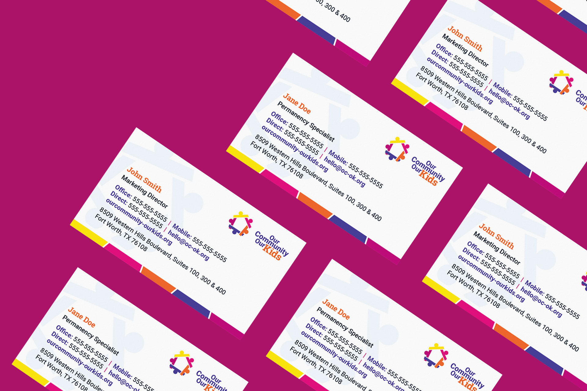
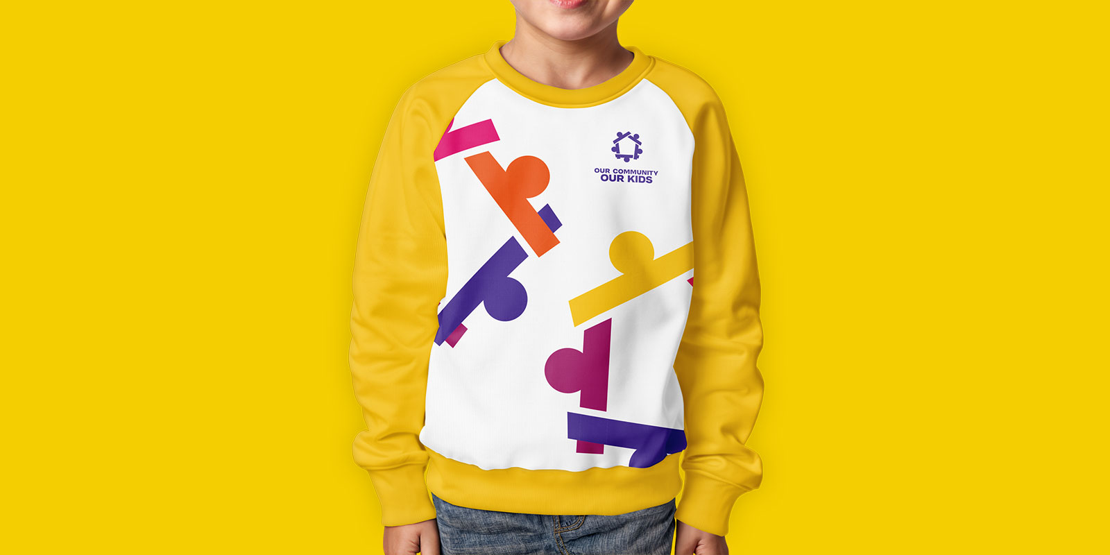
Branding doesn’t stop at business cards. From water bottles to backpacks, OCOK’s swag extends its mission into everyday life—turning essential items into conversation starters and community-builders.

Water Bottle / Backpack

Our Community-Our Kids – Water Bottle / Backpack image 1 Our Community-Our Kids – Water Bottle / Backpack image 2

Sweatshirt

Our Community-Our Kids – Sweatshirt image 1

Gallery

Our Community-Our Kids project image 1