Branding - Main Logo

Strategy + Branding

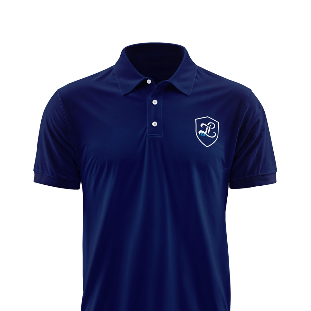
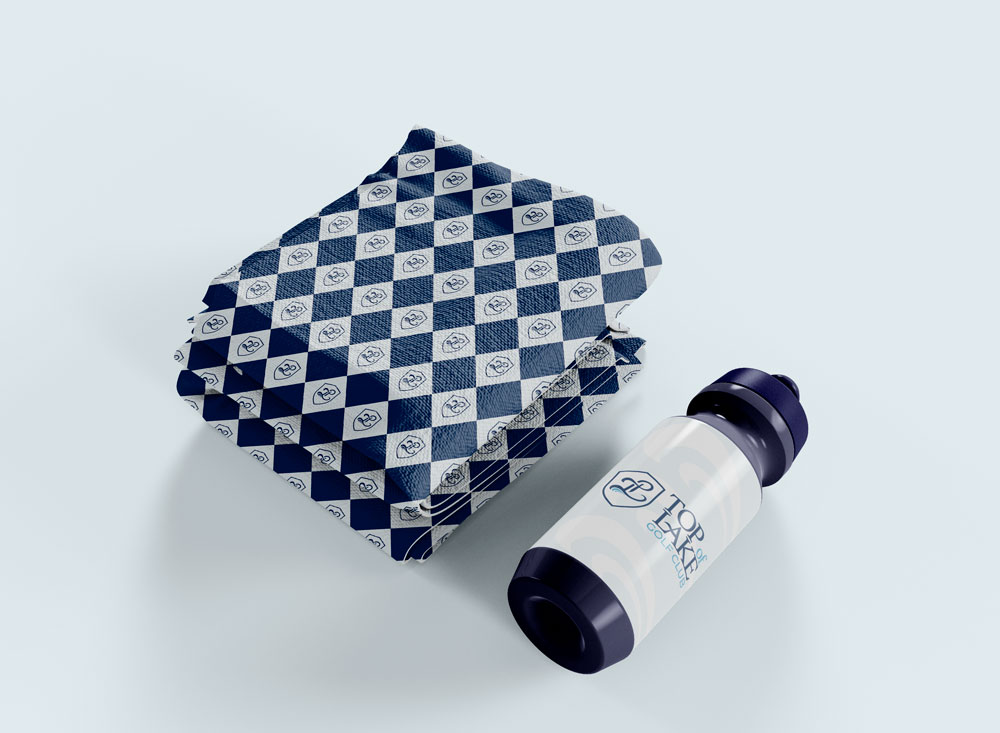
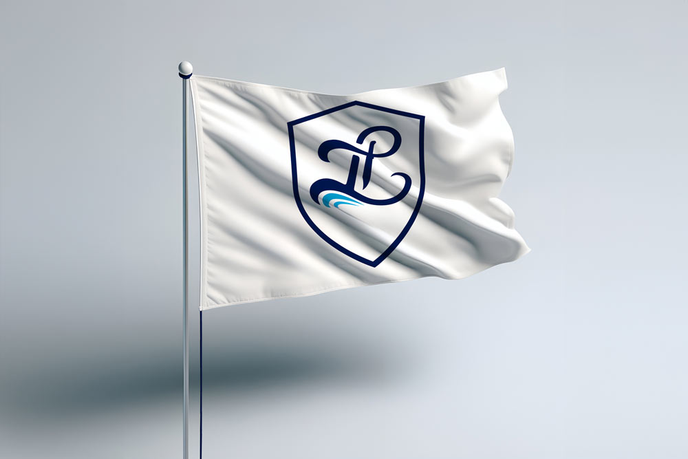
To bring Top of Lake's unique story to life, we explored design concepts inspired by the lake's natural beauty and the area's heritage. The design team created a logo that checked all the boxes with wave-inspired elements in a calming blue palette. This cohesive brand identity seamlessly translates to flags, shirts and pro-shop merchandise, providing a renewed sense of pride for members.
We also developed a comprehensive brand guide which included logo usage, color palettes and typography. This guide ensures that their refreshed brand identity is consistently applied across all materials helping to strengthen their presence and engage both long-time members and newcomers alike.
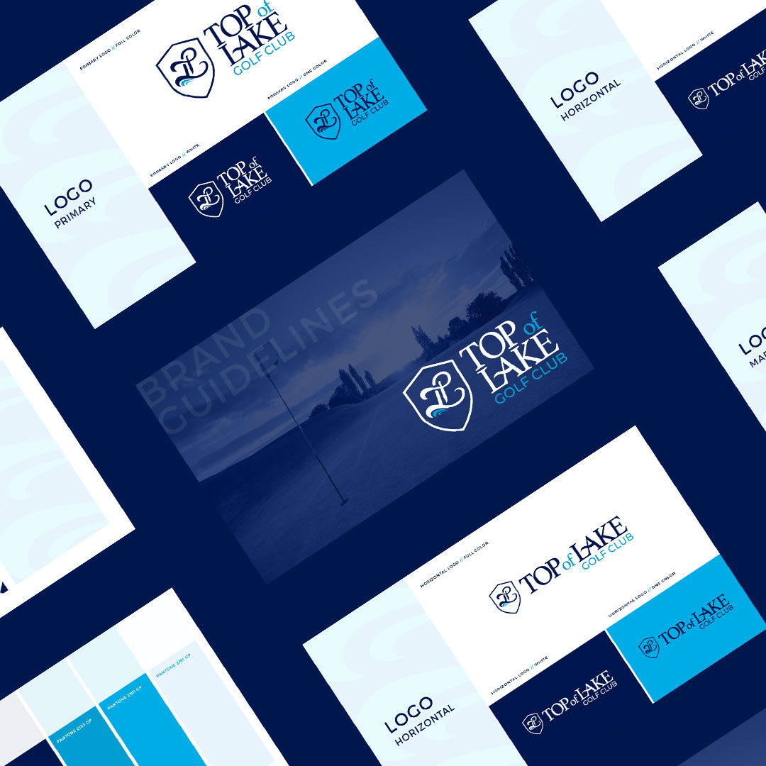
The completed brand package included versatile logo files, custom embroidery designs and a flag design that reflects the club's new visual identity. These elements make it easy for Top of Lake to apply the branding across various touchpoints and create excitement amongst its members.