Brand Refresh + Website + Photography

Vending Nut Company is a trusted, family-owned Fort Worth business with over 55 years of experience roasting premium nuts in-house. While their product quality has always been exceptional, their brand identity and website no longer reflected the warmth and tradition that set them apart.
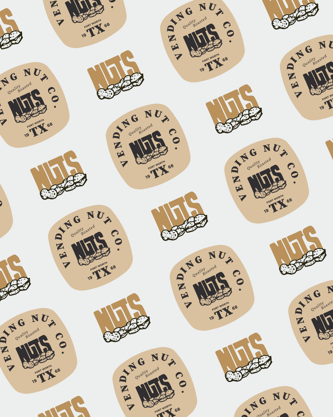
That's where we stepped in. As their Fort Worth marketing partner, we refreshed the brand by refining the typography and brightening the color palette — giving them a more modern, welcoming feel without losing the vintage appeal that's made them a Fort Worth favorite for decades.
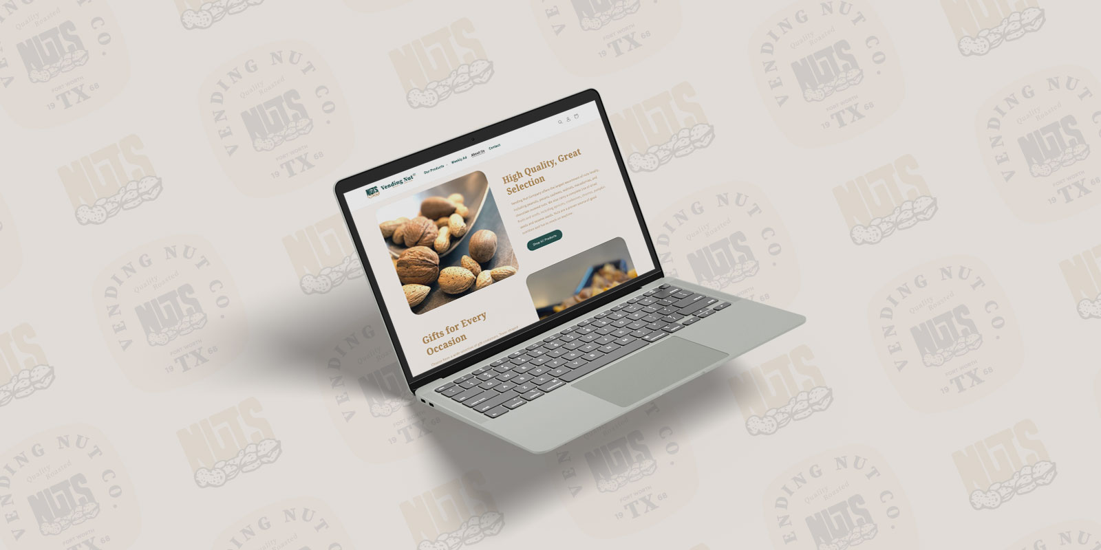
We carried this fresh new look into their website, creating a cleaner design and a friendlier shopping experience. To better serve their primarily older customer base, we streamlined browsing by reorganizing popular products and simplified the checkout process.
Today, Vending Nut Company's brand and website finally match the quality of their products: modern, approachable, and ready to serve customers for the next generation.