Ten Spur
Brand identity and website design for Ten Spur Property Watch — a trusted North Texas home watch service.
Explore Ardent Creative's portfolio of strategic web design, branding, and digital marketing projects for Fort Worth, Dallas, and national clients. See results that speak.
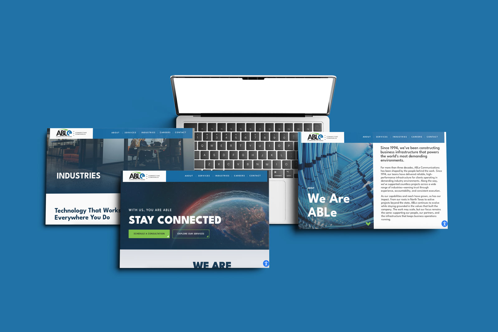
Brand identity and website design for Ten Spur Property Watch — a trusted North Texas home watch service.
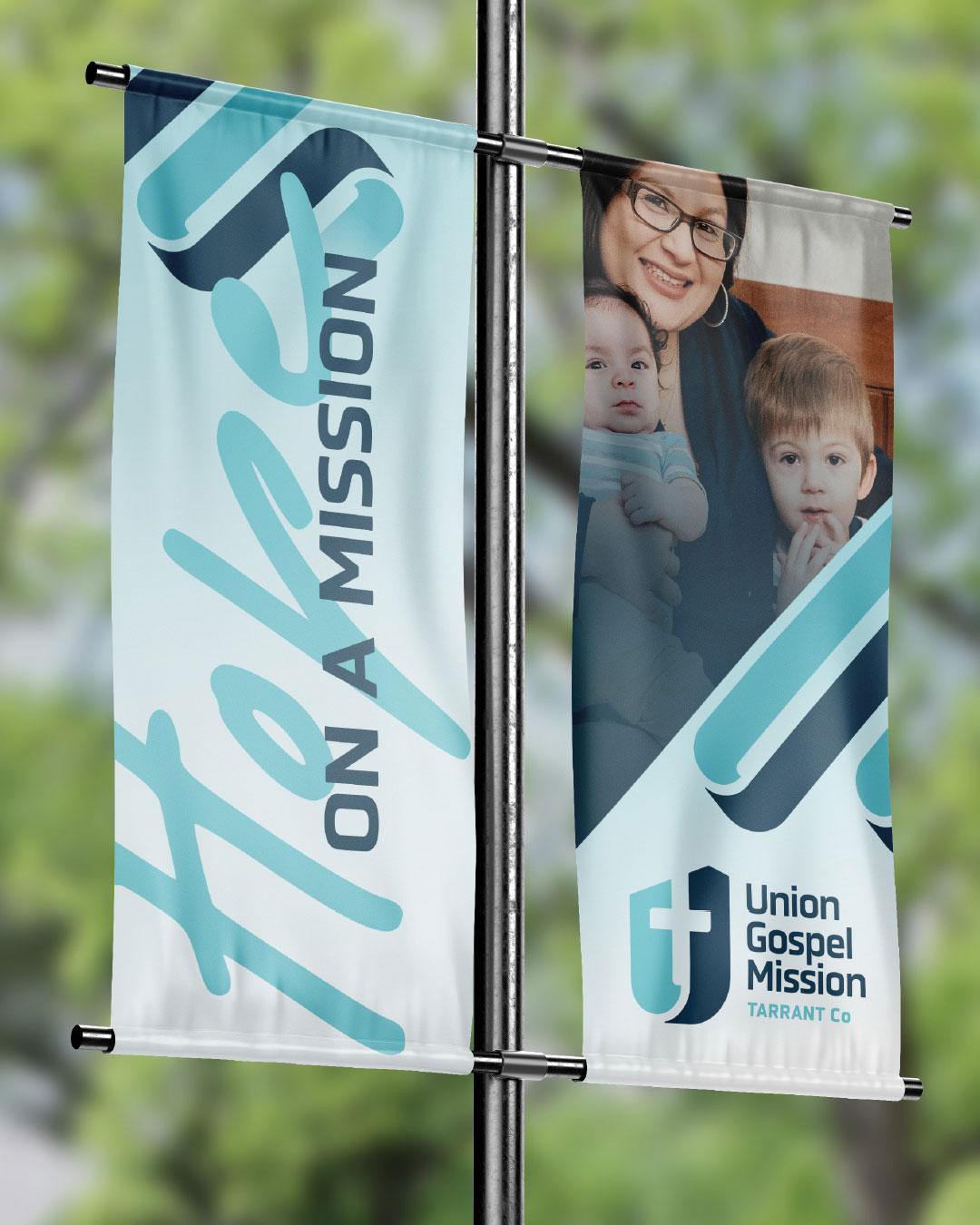
Union Gospel Mission of Tarrant County approached us with a significant challenge: to lead a full-scale rebrand. They needed more than a new logo—they wanted to modernize their identity, reach younger and more diverse audiences, and communicate their mission in a way that drives action. As a beloved community nonprofit, we set out to honor their legacy while helping them step confidently into the future. We began by listening—interviewing stakeholders, diving into research, and uncovering the heart of who they are. From there, we developed a creative strategy that became the foundation for everything: a new logo and visual identity, refined mission statement, compelling slogan, cohesive web copy, complete brand messaging guide and website. This was more than a rebrand. It was a renewal and we were honored to help bring their story to life.
The Saxton Group is one of the largest McAlister's Deli franchisees in the country, owning and operating more than 80 locations across Texas, Oklahoma, and Kansas. They came to us looking for help branding their annual leadership gathering — a high-energy event hosted at WinStar Casino that called for a concept as bold as the venue itself. The vibe they were after was high roller meets five-star resort — glamorous, but with that quiet luxury that doesn't have to try too hard. We translated that into a brand that felt indulgent without being over the top, and built an experience to match, ensuring every touchpoint a guest encountered felt intentional, immersive, and unforgettable.
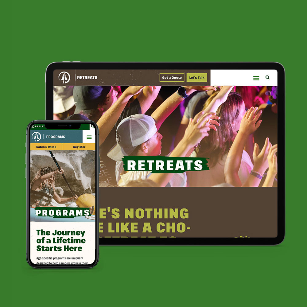
In Texas' competitive summer camp market, Camp Cho-Yeh needed a way to stand out from the crowd. Cho-Yeh also desired a modern website that was both user-friendly to parents and effectively communicated the camp's unique spirit through compelling storytelling and design.
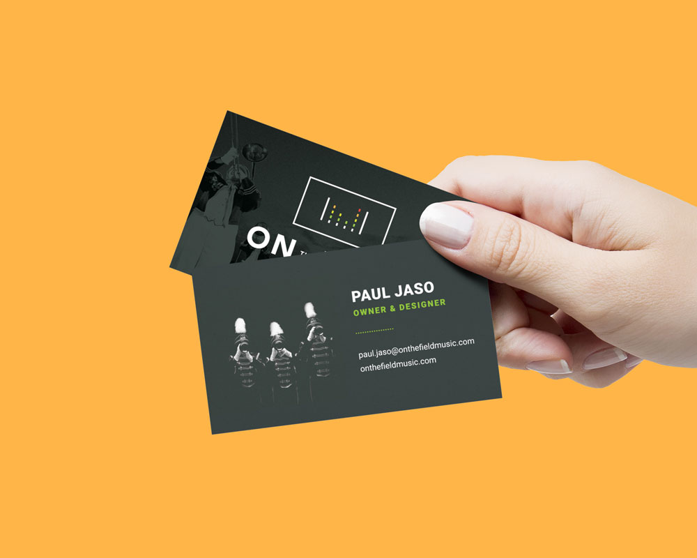
Our musically-inclined client, Paul Jaso, is a creative genius in his own right. This award-winning composer/arranger selected us when it came time to launch his business and brand, On the Field Music. Offering custom music and sound effects for the entertainment industry, Paul needed a full identity package — logo, trade show materials, print collateral, and a responsive website.
Agape Investment Advisors partnered with Ardent Creative to evolve their brand identity following a successful inaugural year. The firm was looking for a refined visual presence that authentically reflects their core values of faith, trust, and unconditional service.
When Ardent's Brad Ball first traveled with Light of Life International in 2009, he didn't go as our agency president or a marketer; he went as someone who believed in the mission. That personal conviction is what's driven Ardent's relationship with Light of Life ever since. Today, Ardent handles content creation, print collateral, email campaigns, and recently, a complete website redesign — all built around one goal: telling Light of Life's story in a way that moves people to act.
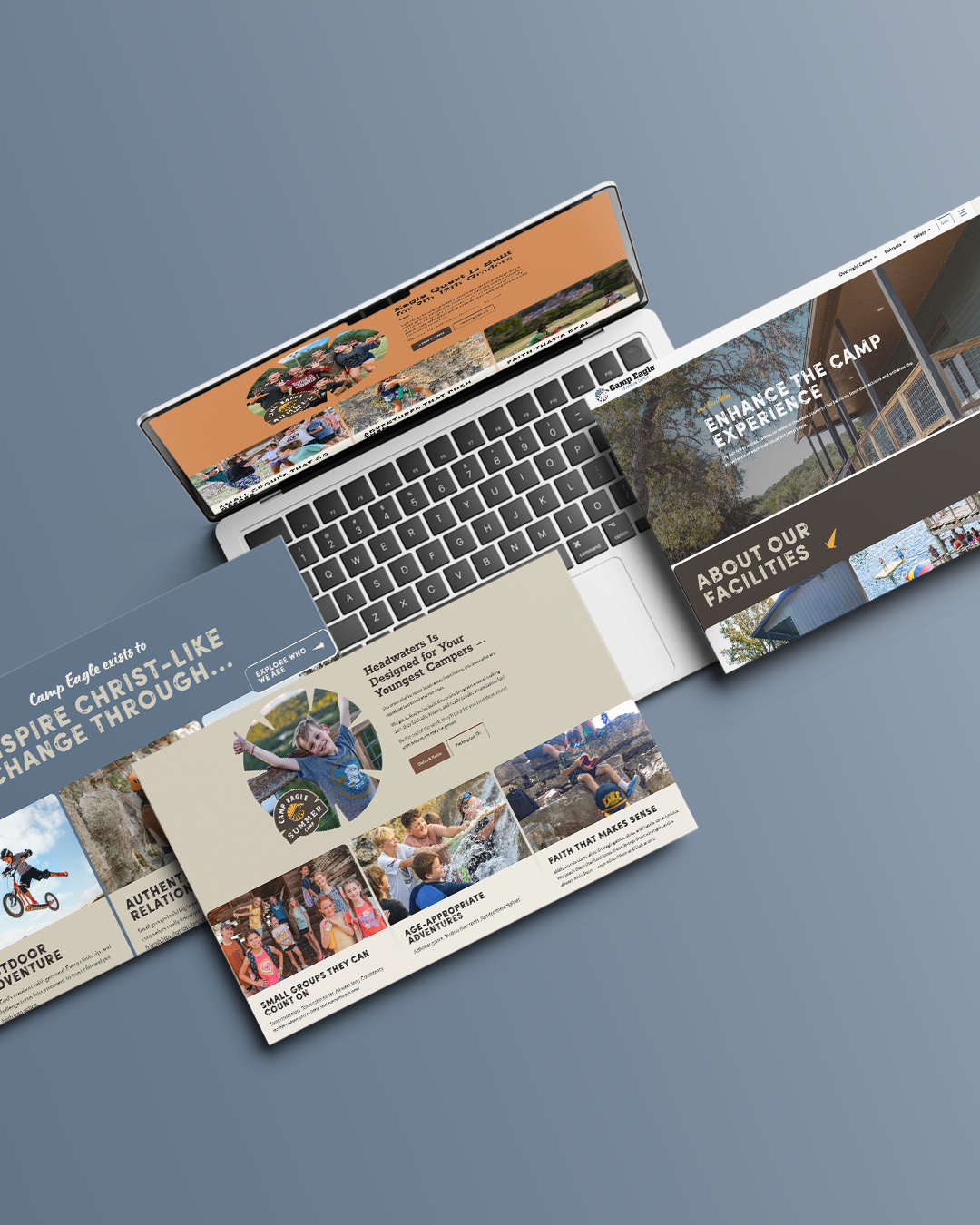
Camp Eagle is a Christ-centered adventure camp tucked into hundreds of raw, beautiful acres of Texas Hill Country — a place so removed from the noise of everyday life that kids can't help but encounter something bigger than themselves. The camp came to us ready for a change: a desire to breathe life into the brand, tell their story with the heart it deserved, and build a website worthy of the mission that would convert more parents into Camp Eagle families.

The Texas Tech MDL Judicial Summit is an exclusive, invitation-only event held in partnership with Texas Tech University. It brings together distinguished judges, attorneys, industry leaders, academics, and Fortune 500 counsel for meaningful engagement and high-level discussions. In 2023, the Summit team partnered with Ardent to design their conference brochure and develop a dedicated website. This collaboration expanded in 2024 when the Summit underwent a full rebrand, which included updating the website to reflect the new visual identity. Since then, we have continued to support the evolution of the brand including yearly updates. Our work has grown to include invitation design, custom-printed commemorative gifts for past attendees, and a range of printed materials that help create a cohesive brand experience and multiple points of connection with participants.
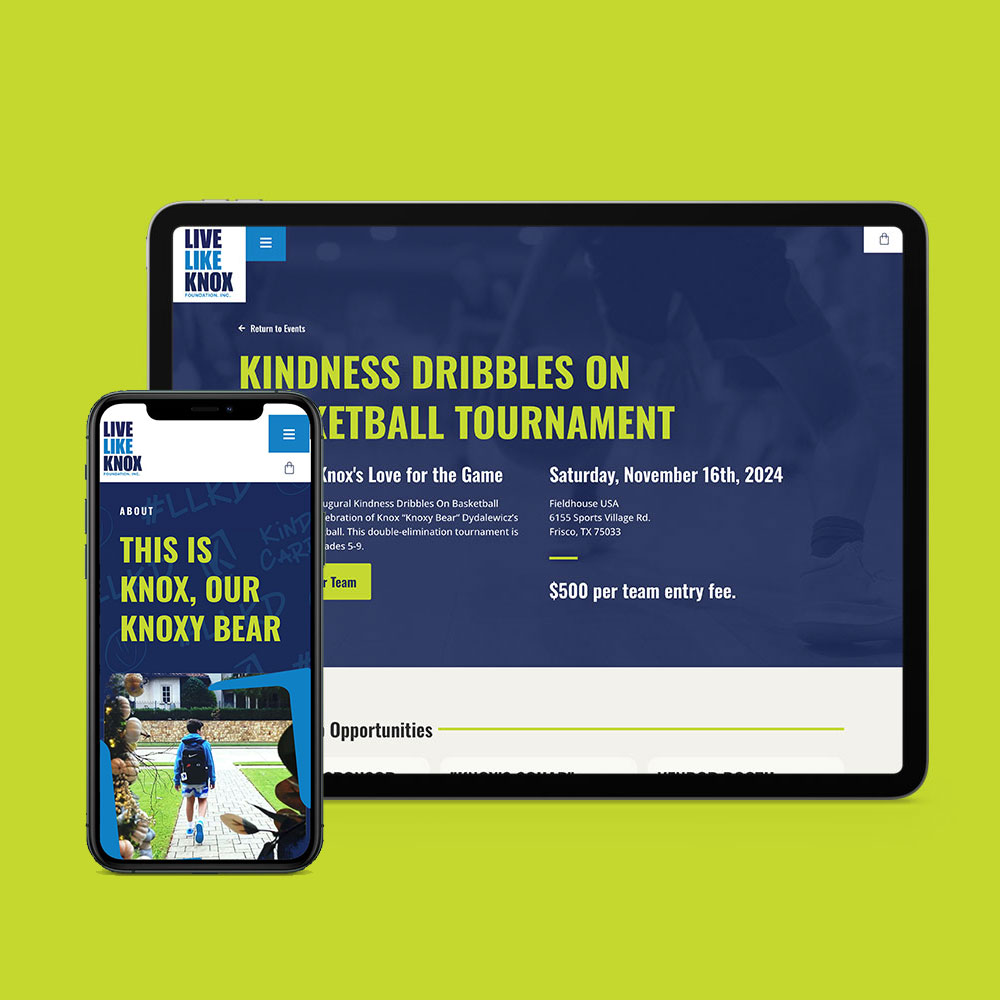
Knox Dydalewicz was a beloved young boy who left an indelible mark on the world. His family, inspired by his spirit of kindness, compassion, and courage, founded the Live Like Knox Foundation to continue his legacy.
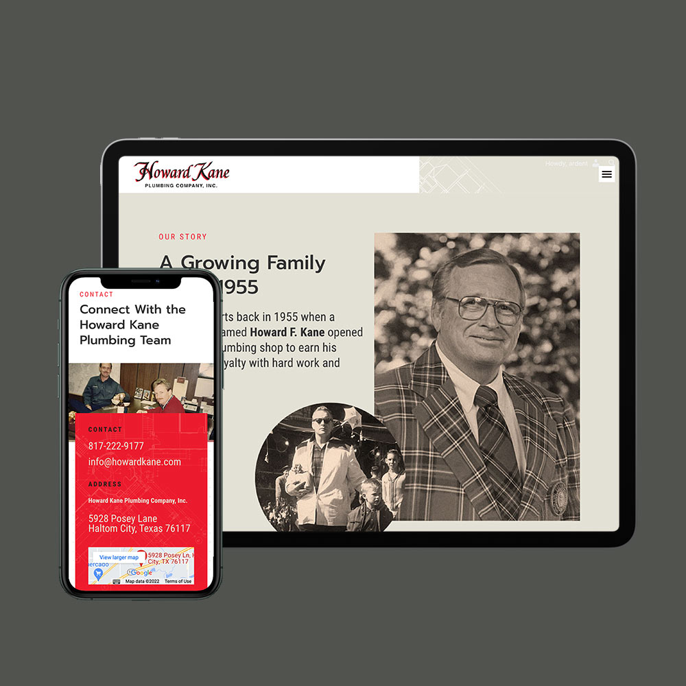
Howard Kane Plumbing has been serving the Metroplex for over 60 years and spans four generations of the Kane family. They are well known in their industry for being the leading commercial plumbing company in North Texas. Ardent Creative rebranded and rebuilt their digital presence from the ground up.
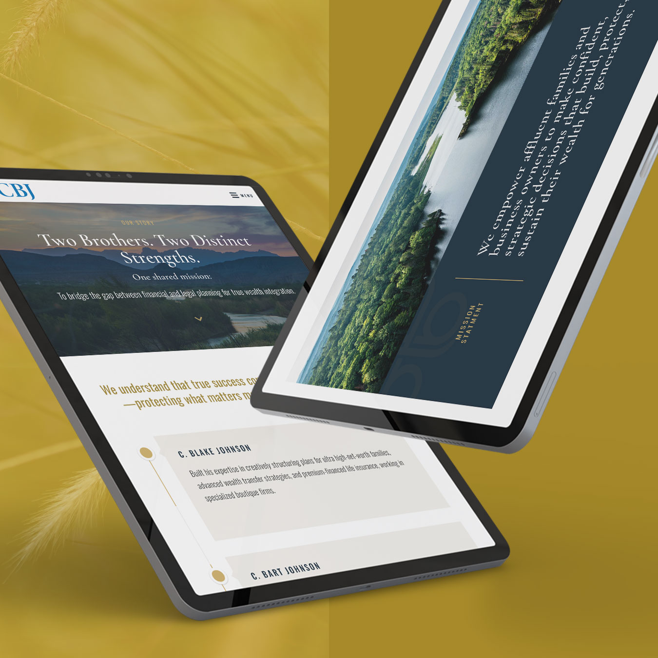
Many high-net-worth individuals don’t understand the need for life insurance, don’t think they can afford it in later years, or realize how it can be utilized as a true tax-efficient asset in their wealth portfolio. CBJ Financial helps affluent families and business owners protect assets, grow wealth, and secure their legacy using life insurance as a strategic tool. Their difference? True integration. CBJ collaborates with every member of a client’s advisory team to deliver comprehensive, tax-efficient solutions, tailored to each unique goal. In turn, we collaborated with them to bring their story to life through a refreshed look and sharper messaging.
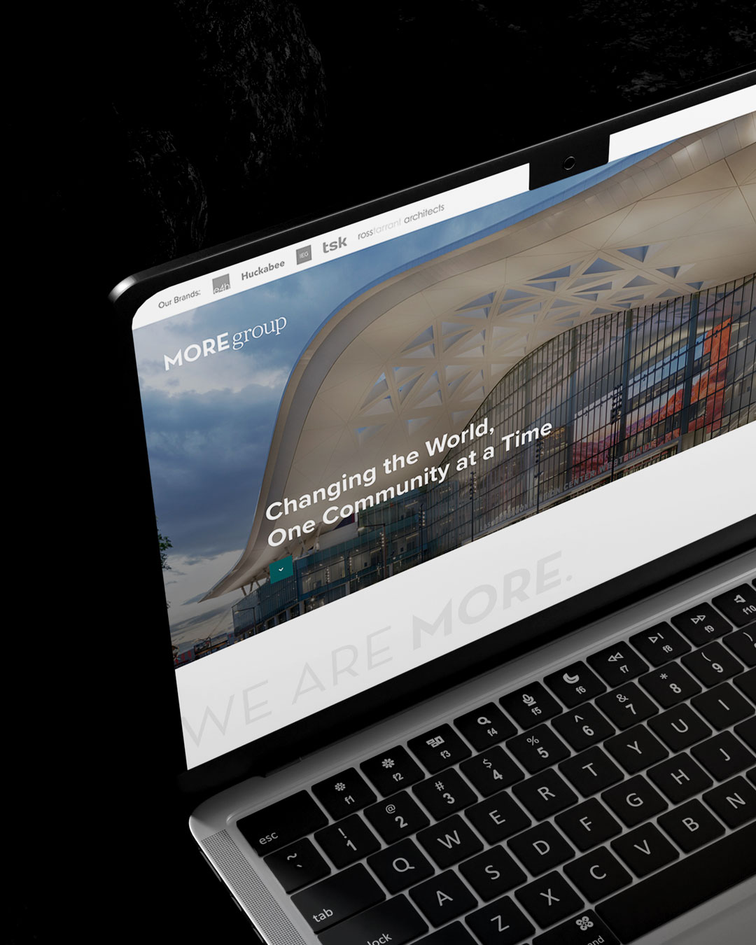
MOREgroup isn’t just about designing beautiful facilities — they’re about transforming the communities they serve. Every architectural project they touch is guided by a vision: to give more to every client and every space they bring to life. Their website didn’t match the amazing impact they’re making in the world, so we designed a custom site that clearly reflects their mission.
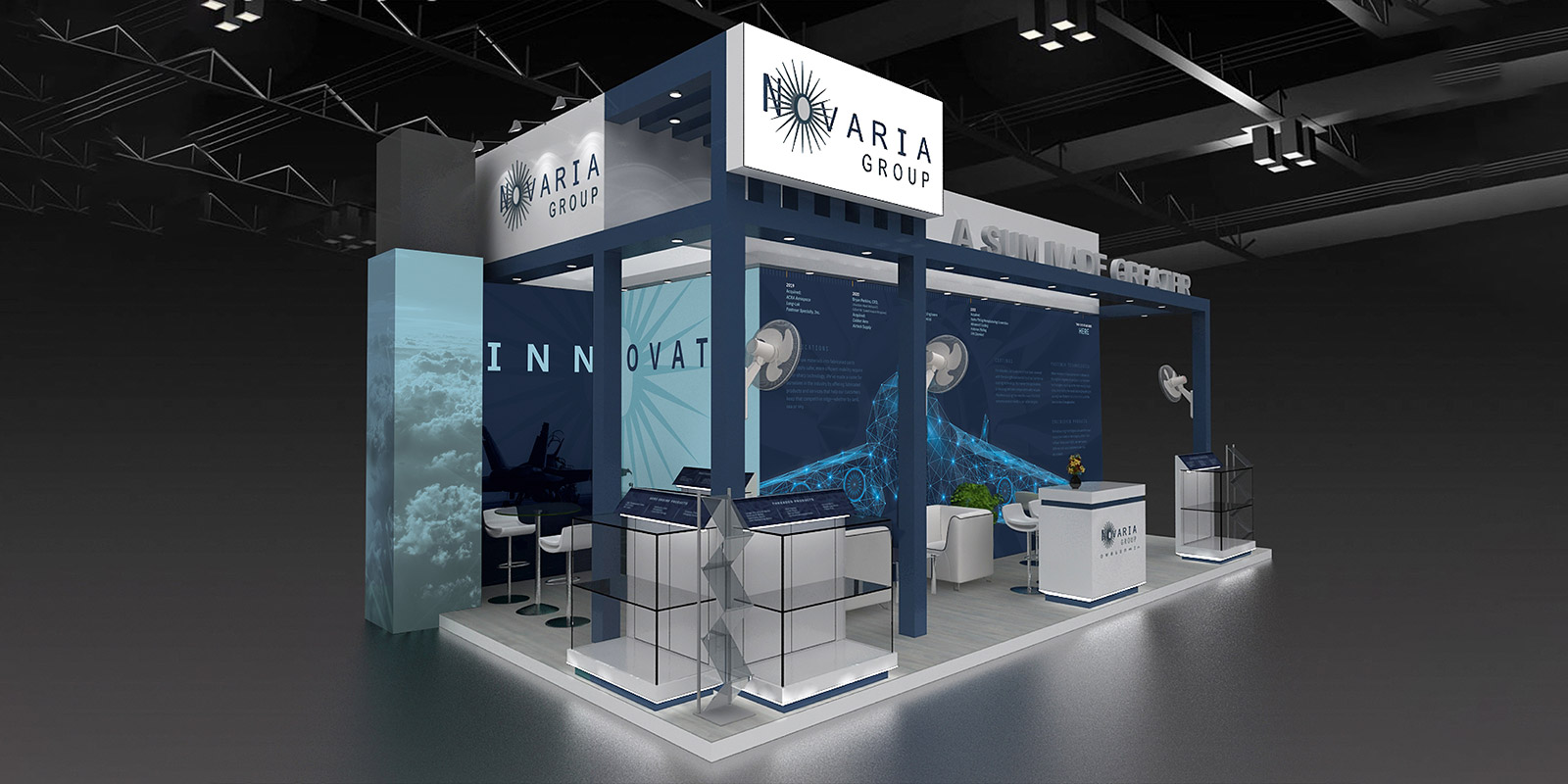
From manufacturing interior fasteners no bigger than the size of a grain of rice to complex engine hardware that’s critical for takeoff, one company is immersed in every facet of flight. Novaria Group is a leading supplier in the commercial and defense aerospace industries, with a family of 16 precision component manufacturing companies under its belt—and plans to add even more. While these companies added new strengths and capabilities, they also presented an issue when it came to branding. Many of Novaria’s acquisitions were long-standing shops with existing, yet disparate, branding. Our challenge was to preserve any existing brand equity these shops amassed all while unifying them under a single identity that represented them for what they were: world-class engineering and manufacturing facilities focused on delivering innovation and optimum performance.
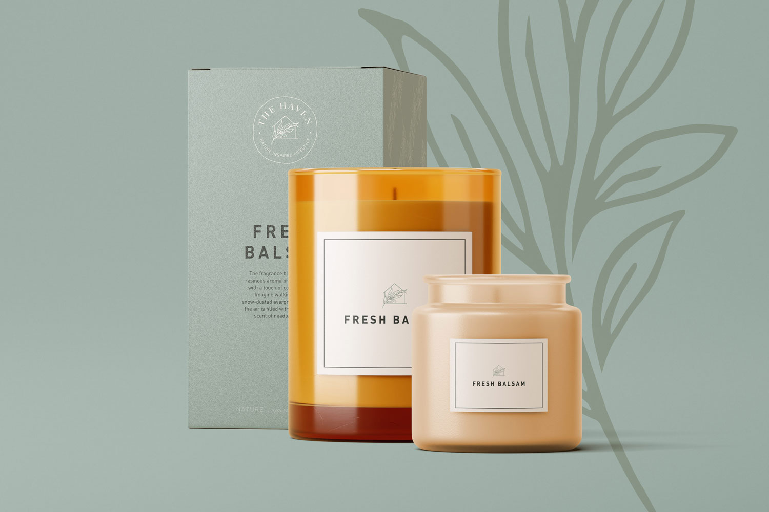
The Haven Brand Identity The Haven approached us to develop a comprehensive brand identity that went beyond just a logo. They wanted a deep exploration of their company’s potential and how they could truly connect with their audience. We started with a clean, minimal logo and...
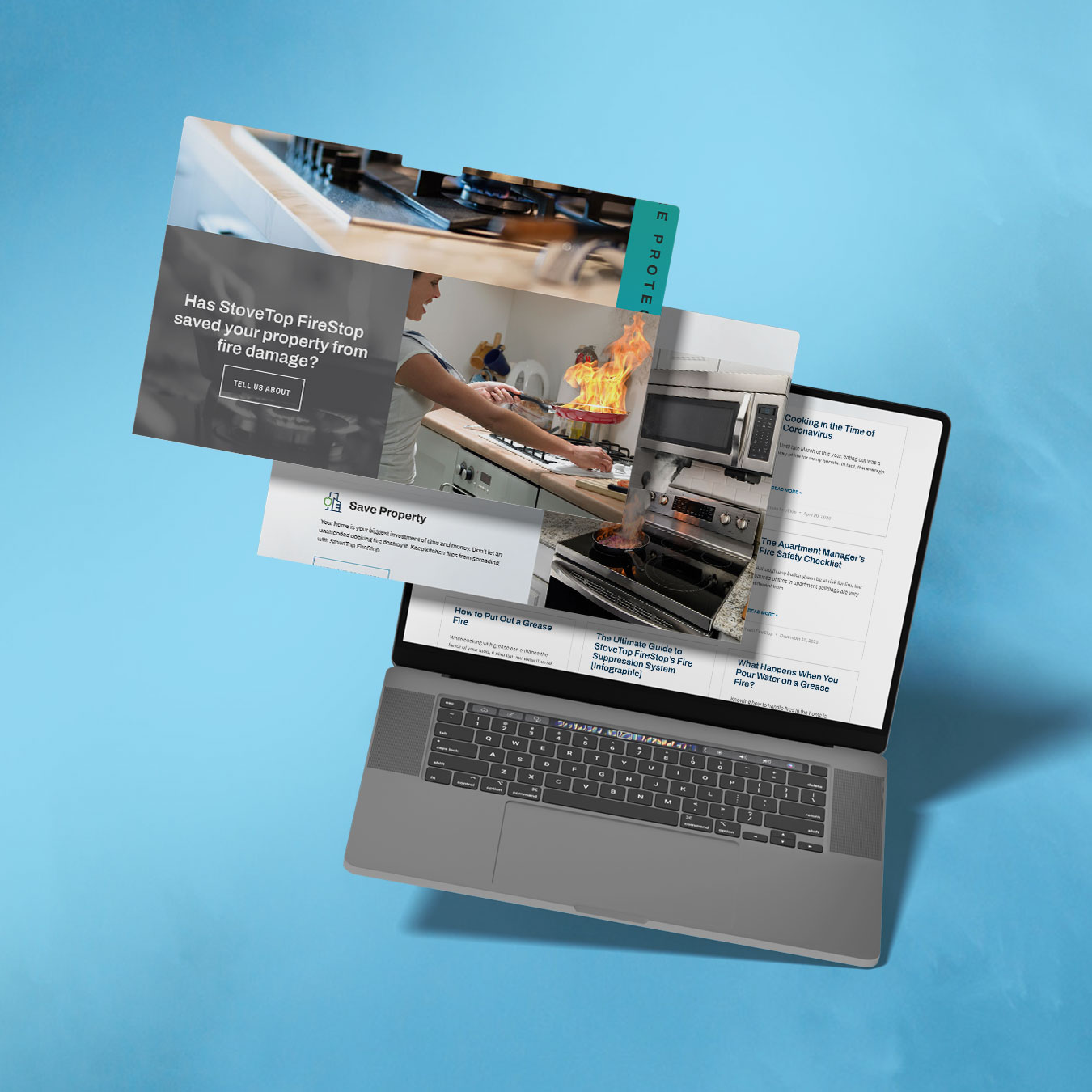
StoveTop FireStop is on a mission to protect what matters most-families and homes-from the most common cause of devastating home fires: cooking. For over 50 years, this Fort Worth-based, family-owned company has led the way in automatic cooktop fire suppression, creating smart, effective devices that activate automatically when a stovetop fire starts. We designed their original website about a decade ago and it was time for a reboot. StoveTop FireStop needed a website that matched the simplicity and dependability of their product. We gave their site a full refresh-new brand colors, simplified navigation, and enhanced product storytelling designed to educate and convert.
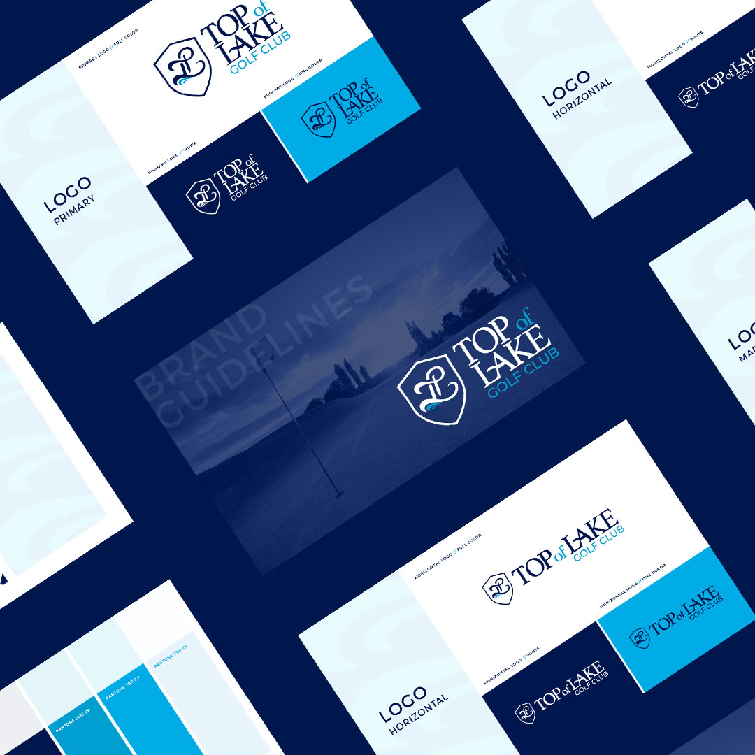
After years of decline and a devastating tornado in 2015 that destroyed its clubhouse, Top of Lake Golf Club went through a name change and lost some of its original identity. With new ownership, the club aimed to reconnect with its roots and restore the “Top of Lake” name that locals had long cherished. Ardent Creative partnered with them to develop a refreshed brand that honors the club’s rich history and scenic lakeside setting, inviting both loyal members and new players to experience the club anew.
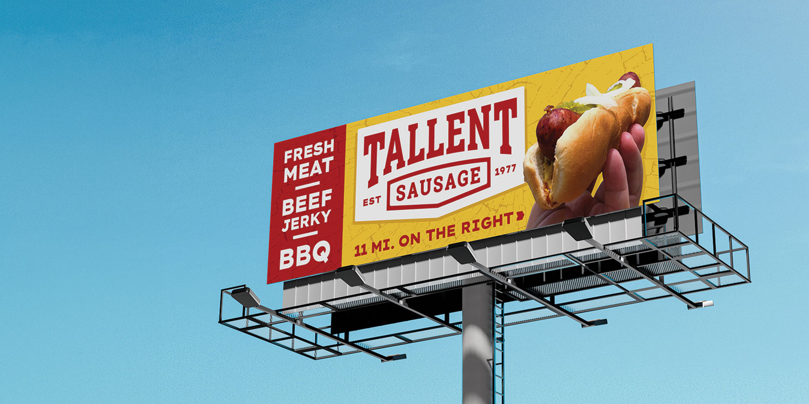
Legends don’t take shortcuts. It’s a lesson we learned from our slow wood-smoked sausage client — and one we couldn’t agree with more. Tallent Sausage began humbly as a small-town grocery store and meat market, but their wood-smoked sausage quickly became the star of the show. What started as a local favorite soon put them on the map of East Texas for their award-winning sausage — known for real wood-smoking, no fillers, and unforgettable bold flavor. But while their product was legendary, their branding was stuck in the past. Tallent wanted a fresh look that celebrated their roots while connecting with today’s customers. Our team dug into the creative strategy and handcrafted a rebrand that was timeless yet true to their story — complete with a new slogan that says it all: “Great Sausage Takes Tallent.”
As a brand focused on student services, we wanted Rightwise to feel friendly and approachable. The bright colors and free form shapes added personality and gave a lighthearted feel to the academic website. With a less formal logo, Rightwise appears welcoming to students who are likely intimidated by the college application and admissions process.
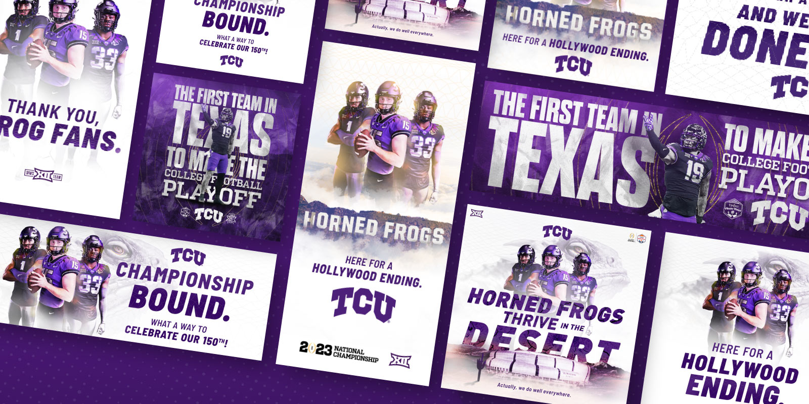
Our long-term client, TCU, called on us to help them pull off a marketing feat of the century in a few short weeks. We partnered with their marketing team to produce four national show-stopping ad campaigns. Our marketing efforts promoted TCU Football as they went from the Fiesta Bowl to the National Championship. Football fanatics were tweeting our work all over the country — social and digital billboard ads, the Fiesta Bowl program, national newspaper ads, digital animations, and national ad suites. Our journey with TCU to the Natty was historic — and so was the work.

Vending Nut Company is a trusted, family-owned Fort Worth business with over 55 years of experience roasting premium nuts in-house. While their product quality has always been exceptional, their brand identity and website no longer reflected the warmth and tradition that set them apart. That’s where we stepped in. As their Fort Worth marketing partner, we refreshed the brand by refining the typography and brightening the color palette — giving them a more modern, welcoming feel without losing the vintage appeal that’s made them a Fort Worth favorite for decades. We carried this fresh new look into their website, creating a cleaner design and a friendlier shopping experience. To better serve their primarily older customer base, we streamlined browsing by reorganizing popular products and simplified the checkout process.
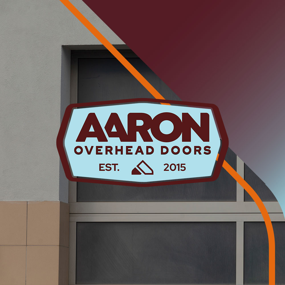
Aaron Overhead Garage Doors came to us with a simple goal: update their brand so it actually reflected the quality of their work. They were already well known and trusted around Atlanta, but their visual identity hadn't kept up with the level of service they were delivering.
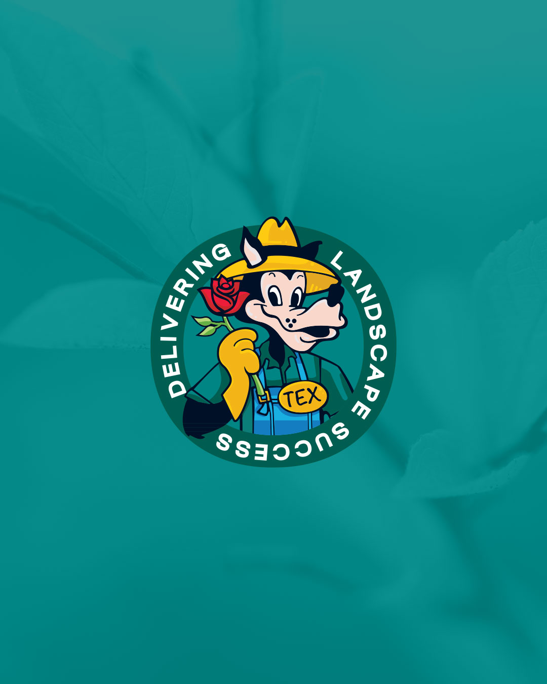
With roots running deep in Texas soil for over a century, Wolfe Nursery isn’t just where landscape professionals go to grow their business—it’s a piece of Texas history. Generations of Texans remember the name, the plants, and of course, Tex the Wolf. But even the most beloved legends need a refresh now and then. Our mission was to honor Wolfe’s rich heritage while giving the brand a fresh, modern edge that could thrive in today’s market. We started by reimagining the logo’s mascot—Tex the Wolf—keeping his fun, familiar spirit while refining his look for both print and digital. We brought consistency to the brand with standardized colors, updated that signature red rose and created a flexible logo system that works everywhere Wolfe shows up. The result is a look that feels authentic and familiar all while pointing confidently toward the future.
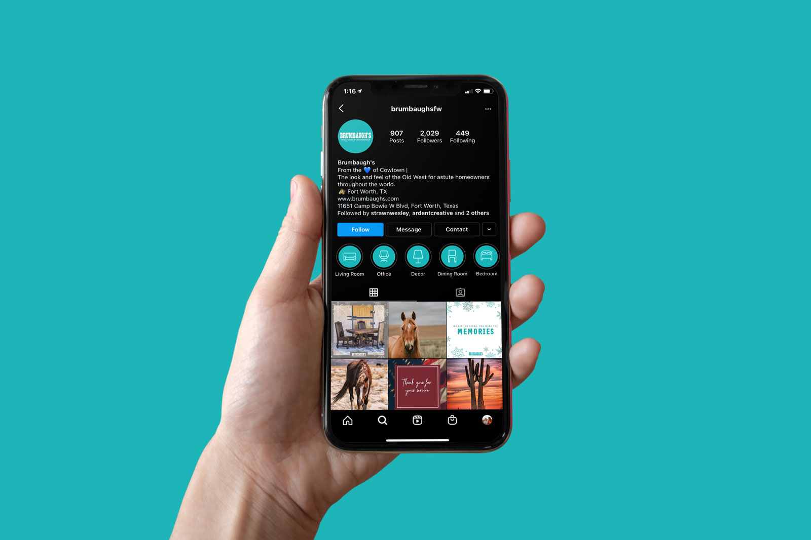
Brumbaugh’s Fine Home Furnishings is a luxury Western home store located just west of Fort Worth. With their ranch-inspired aesthetic, our team used rich turquoise and Western-inspired imagery to set the tone for both their e-commerce site and social platforms. To drive web traffic and improve brand recognition, our digital marketing team heavily focused on Pinterest. Using mainly organic posting to attract qualified digital leads, we created a successful long-term strategy with minimal ad spend. In addition, a polished Instagram presence elevated Brumbaugh’s brand online to feel local yet sophisticated.
Ironwood Cyber Inc. is a cybersecurity products and services company that needed a website to accurately represent the high-tech, cutting-edge work it performs on a regular basis. Our designers created a concept that emphasizes the idea that cyber is an element of life. That translated into a site that has bioluminescent-like features and original illustrations of robot mascots steadfast at work in a bustling tech city. The design embodies cybersecurity’s inner workings and simplifies complex concepts in an illustrative and beautiful way.
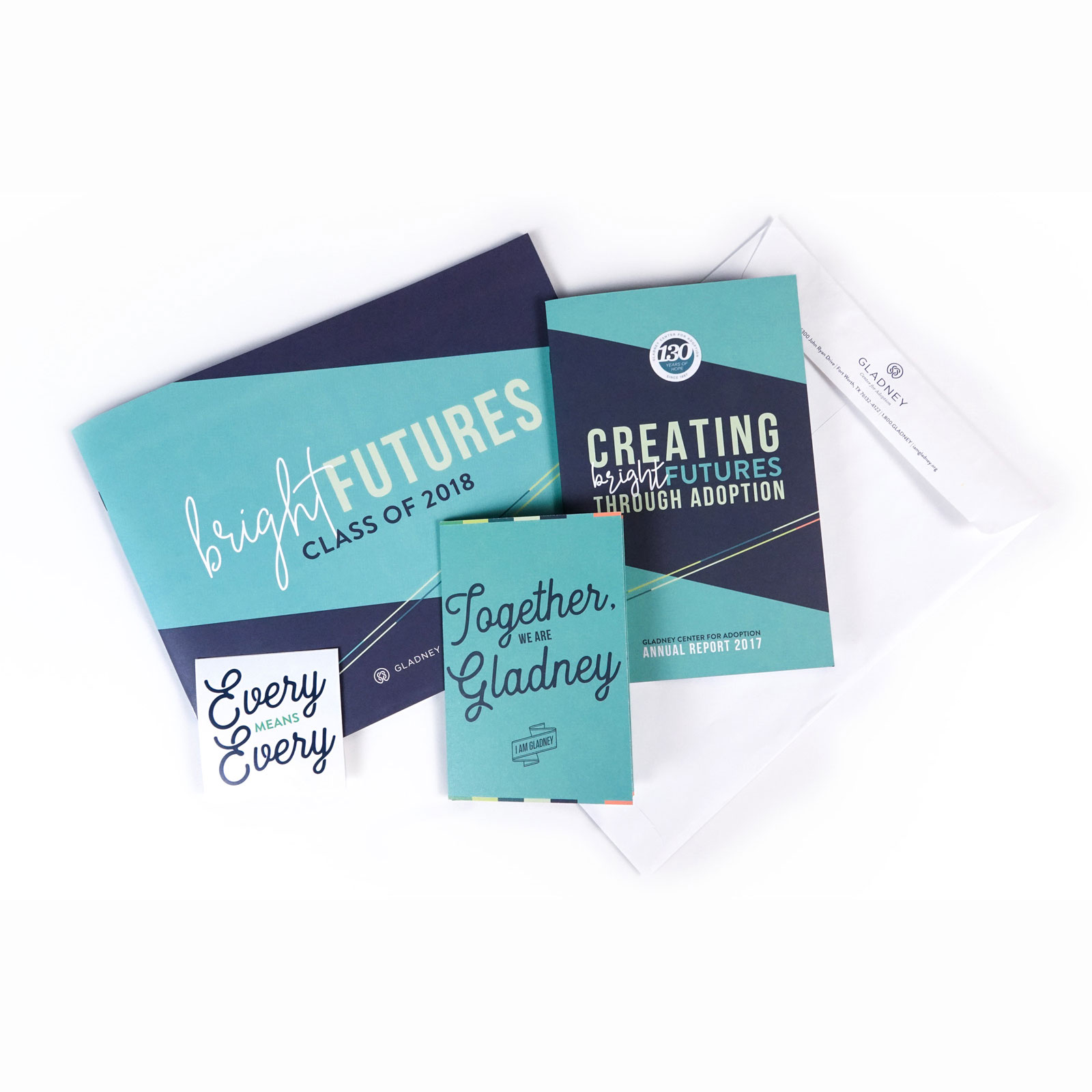
Gladney is near and dear to us here at Ardent. Having a Gladney dad among us, we understand what makes this adoption center so special. Our work with Gladney puts us in a unique position to make a memorable impact on families whose lives are transformed by adoption. From designing the celebratory signs displayed at adoption finalizations and the one-of-a-kind invitations for special events to crafting materials for The Gladney Cup and fundraising mailers, we pour our hearts into every project. We’re committed to helping Gladney spread its message and connect children with the loving families they deserve.
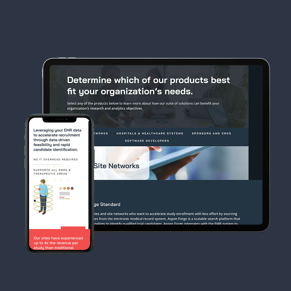
Aspen Insights is a healthcare data science and artificial intelligence firm based in Fort Worth, Texas, with a focus on clinical research sites and hospitals/healthcare networks. The problem? Their website didn’t accurately tell their story or illustrate their capabilities. When you’re on the cutting edge of healthcare innovation, you need an equally impressive website designed to show off what you do. Cue the Ardent team. One of Aspen Insights’ unique offerings is its clinical trial recruitment process, and they needed a way to showcase this on the website. We rolled up our sleeves and got right to work. Our designers developed a page that featured a scrolling animation method, which effectively demonstrated the recruitment process in an engaging and informative way. The website copy and illustrations were designed to convey Aspen Insights’ brand identity and value proposition. The website was built with a user-friendly interface, making it easy for visitors to navigate and find the information they need.
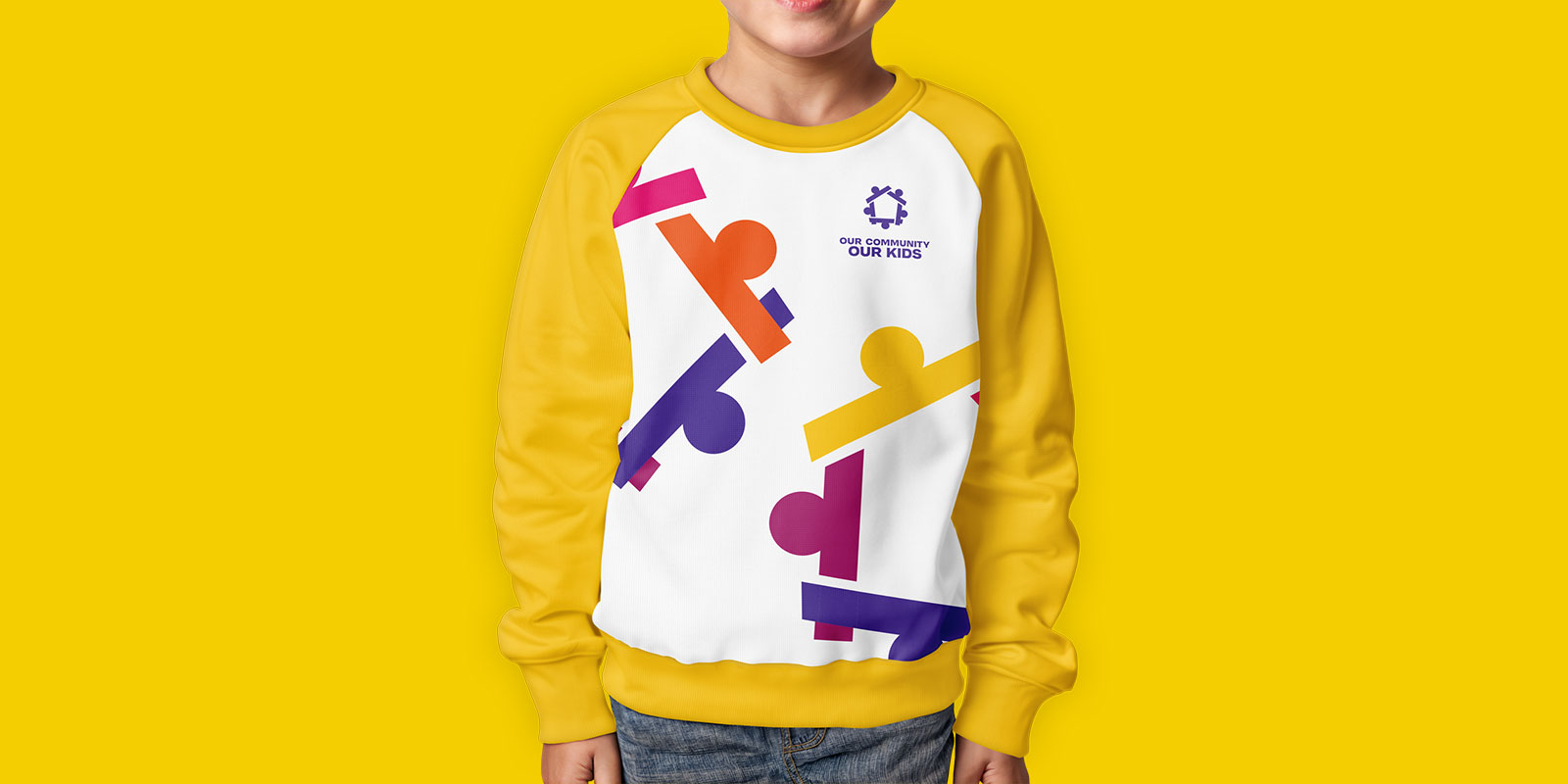
At the heart of every great brand is a powerful story. For Our Community Our Kids (OCOK), that story centers on transforming lives and strengthening families through innovative, community-based care. Partnering with the State of Texas, OCOK reimagines foster care and adoption services, ensuring children and families receive the support they need to thrive. When it was time for their identity to reflect the depth and impact of their mission, we stepped in to craft a new look as dynamic and inspiring as their work.
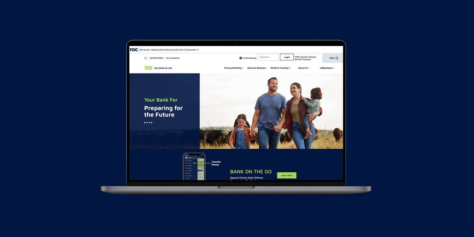
TFNB Your Bank for Life focuses on just that: being your local financial partner through all of life’s events. We highlighted TFNB’s friendly, welcoming culture in their rebrand. Using bright colors and focusing on happy, familiar faces, we celebrated the Central Texas community that TFNB is proud to serve; we made the local community a central focus in all of our work because local heroes, local businesses, and local families are at the heart of TFNB.
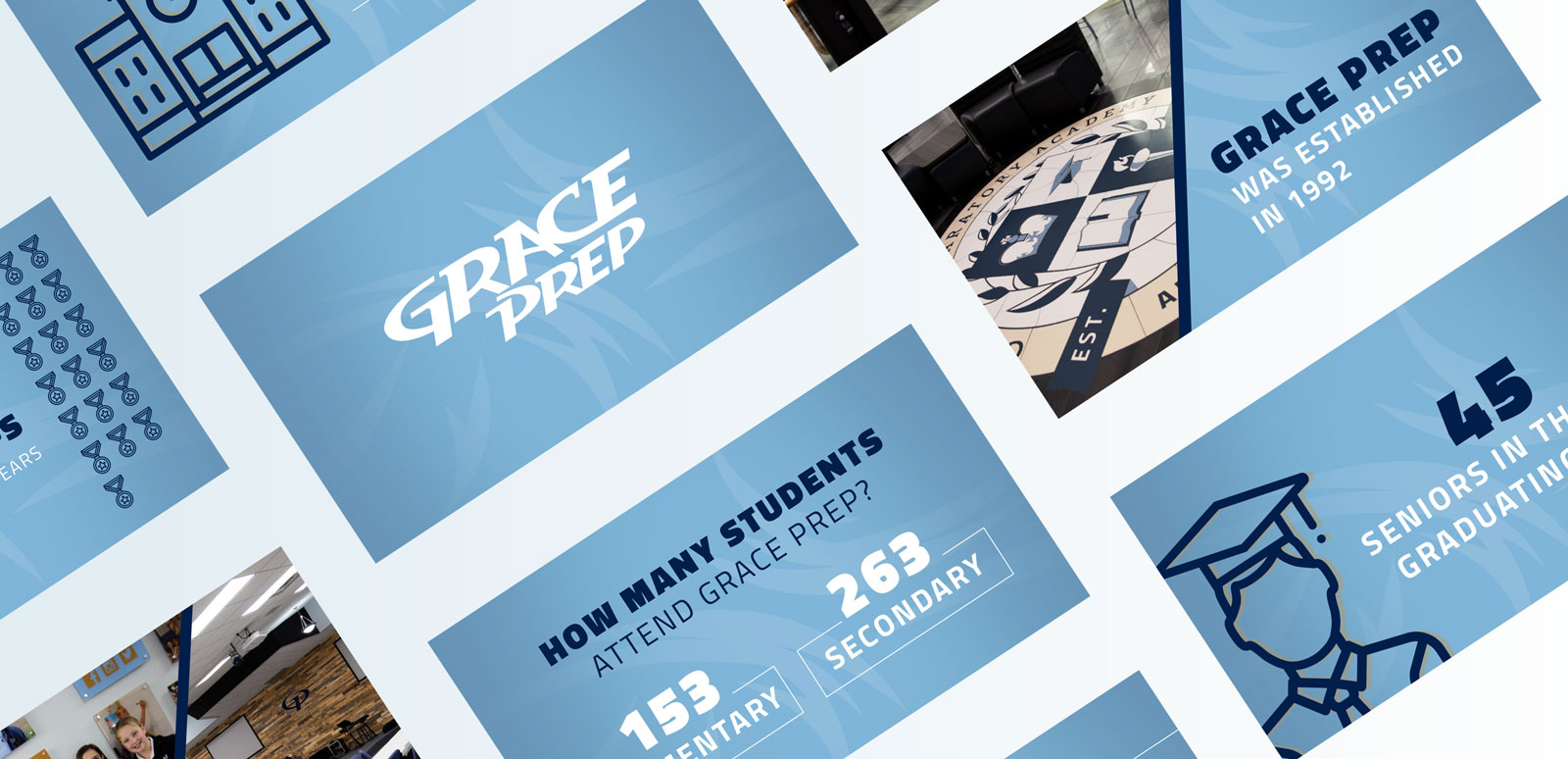
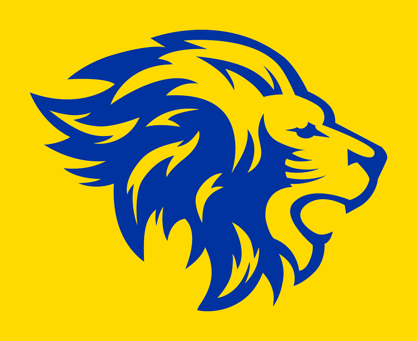
We’ve been proud to partner with Grace Preparatory Academy on nearly every area of their brand. Initially, this private Christian academy in Arlington, Texas, came to us for a brand refresh. We were also tasked with creating a lion image to represent their school mascot. Our design team went to work, creating a fearless new face for the GPA Lions while also restyling their logo and seal. We outlined comprehensive brand standards to guide the use of their colors, fonts, and logo, increasing cohesiveness across their facilities, as well as their print and digital communication. Our efforts culminated in a new website that highlighted their fresh, elevated look. Our partnership has continued with campaign-based projects. The Ardent team designed brochures, invitations, giving cards, and digital marketing assets (and even directing photoshoots) to support multiple campaigns such as their G3 development campaign and their annual North Texas Giving Day initiative. After wrapping up their most recent capital campaign, Ardent stepped in to design a new gym floor as well as the growing “Wall of Champions.”
Bloom Strategy Branding + App Sharing the same mentality that one size just does not fit all, we were delighted when Bloom Strategy tapped us to develop custom-designed software that supports every part of their legal consulting business. Our designers and developers flexed...
Axe and Horn Meadery is a small-batch meadery committed to crafting high-quality meads with fair trade and locally sourced ingredients. They prioritize consistency and conscientious production to create unique, flavor-forward beverages. We designed a brand that sets them apart from the typical Viking and bee imagery seen in most mead brands, giving them a fresh, distinctive identity.
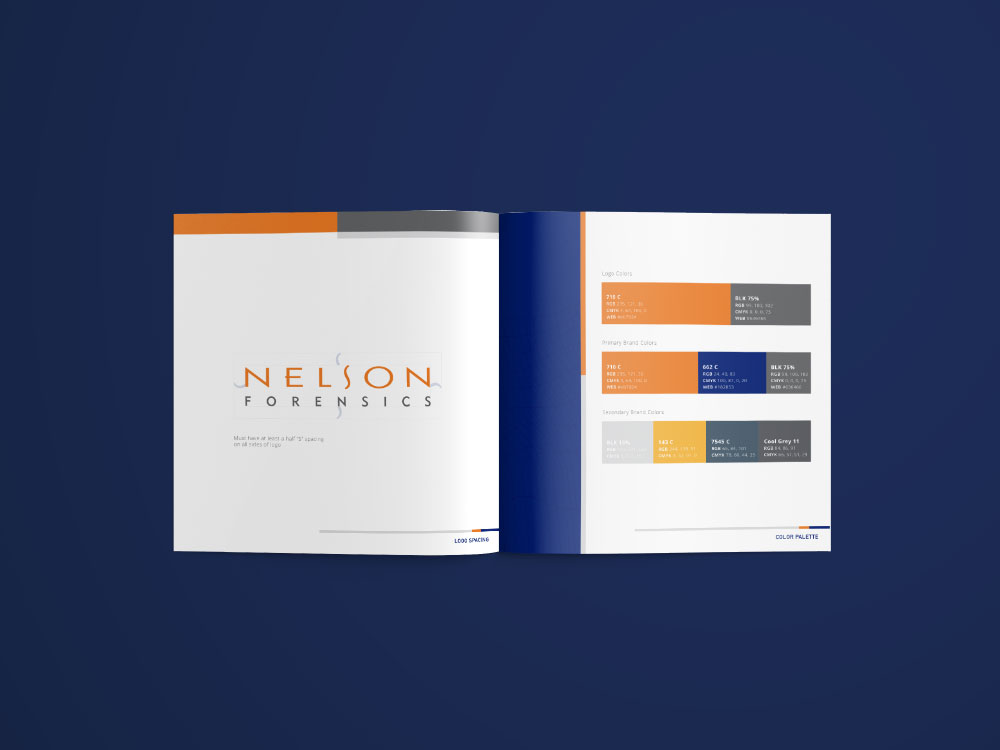
Nelson Forensics came to Ardent wanting a redesign of their website. They wanted it to be bold, eye catching and showcase the projects they have worked on. We refreshed their brand colors to make them stronger, incorporated different elements to show the details of each project, and had staff photos taken to carry out the brand in every asset on the site.
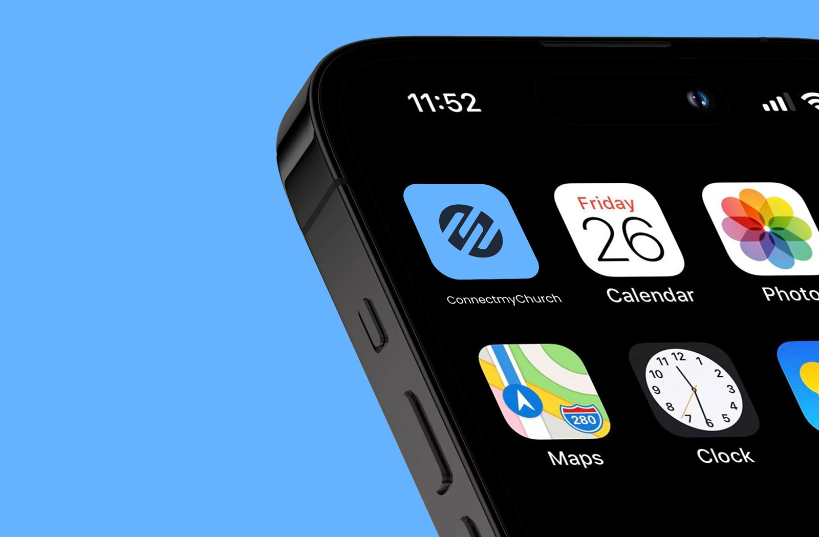
Too often, church communication is scattered across various apps, making it a frustrating and outdated experience for members. Connect My Church solves this problem by providing one central platform where members can communicate, find events, give and register—all in a space designed specifically for church families. Connect My Church tasked us with developing a brand identity that truly reflected their heart for ministry—a desire to help churches strengthen connections with God and the relationships within their church family. Understanding their desires, our designers connected the dots and flexed their pixels to create a brand identity that reflects the mission. The result? A clean, modern logo and a welcoming blue color palette that inspire trust and connection, ensuring the brand feels as engaging and accessible as the platform itself.
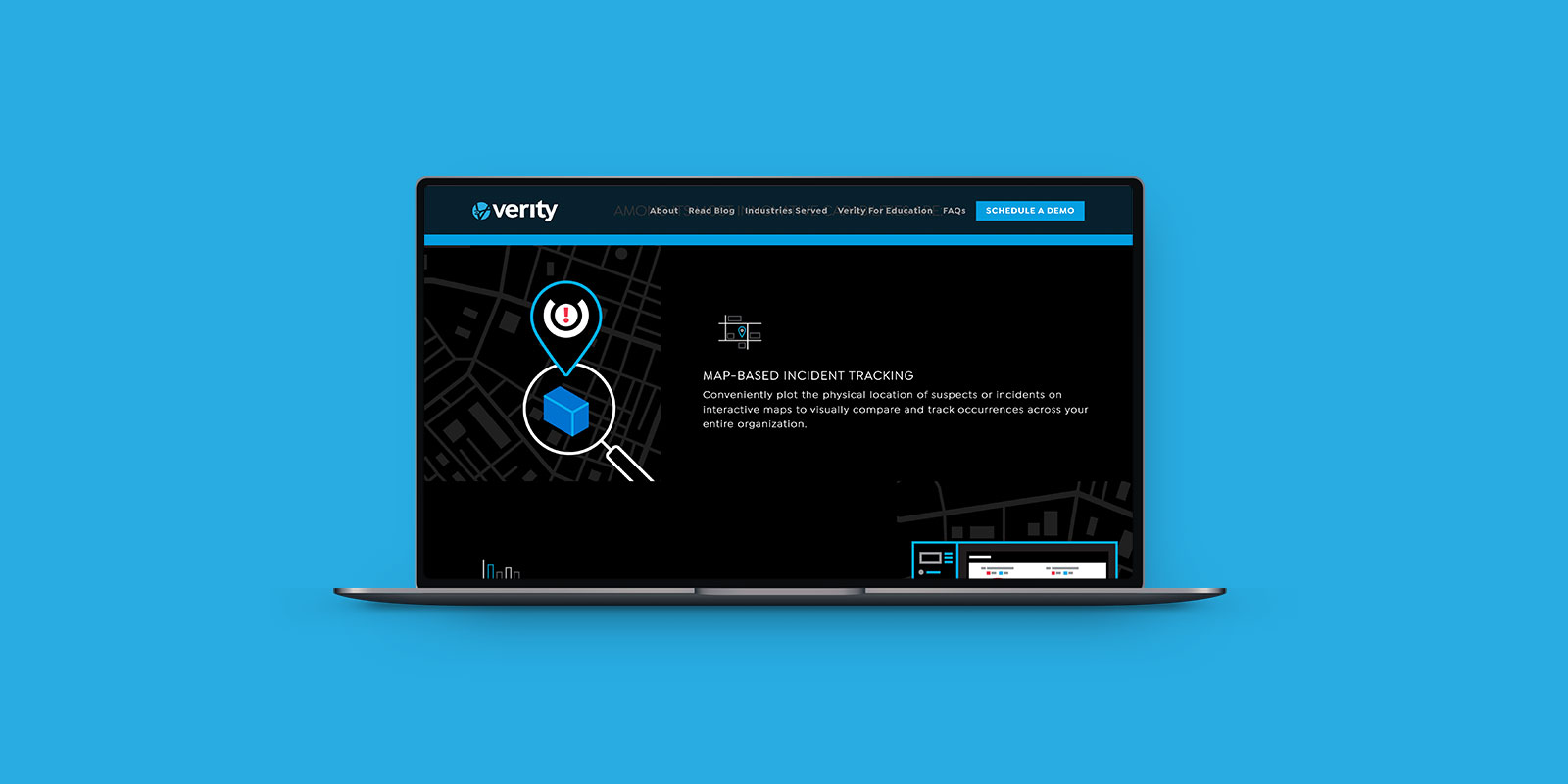
Verity Software Branding + PRINT + Web Design We not only envisioned the brand; we built the software. Ardent is proud to own the Verity brand, a company that creates digital risk management solutions for a variety of industries. We designed the brand logo, website, and print...
A long-term relationship allowed us to be top of mind when Bethesda Christian School was ready to refresh its brand and produce other marketing campaign materials for its upcoming capital campaign. Overall assets produced included a modernized logo design, a branding guide, a mascot creation, a redesigned website with content strategy, and capital campaign print collateral.
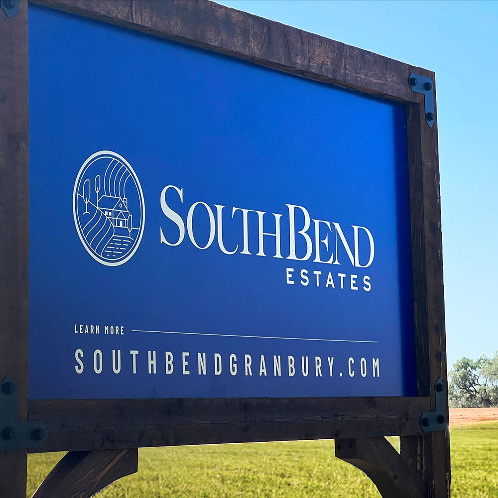
SouthBend called on Ardent to capture the essence of this real estate project and bring the inspiring vision of SouthBend to life. The new development needed a narrative that struck a balance between the roots of rural living and the luxury offerings of SouthBend—educated and classy, but grounded and not pretentious. The verbal identity we created portrays a lifestyle unlike anything else in Texas, where homeowners can escape into the beauty of Texas’ rugged nature, without compromising on the finer things in life. Through logos, icons, and color palettes, we built SouthBend’s visual identity from the ground up, landing on an aesthetic that included nuances of the classic mid-century art-deco styles, with illustrative references of a country home executed with modern touches of today’s design trends. The entrance signage we created that greets visitors, combined with the interactive website we developed that displays watercolor renderings of the lots, helps prospective homebuyers experience first-hand what makes this place along the Brazos river so special.
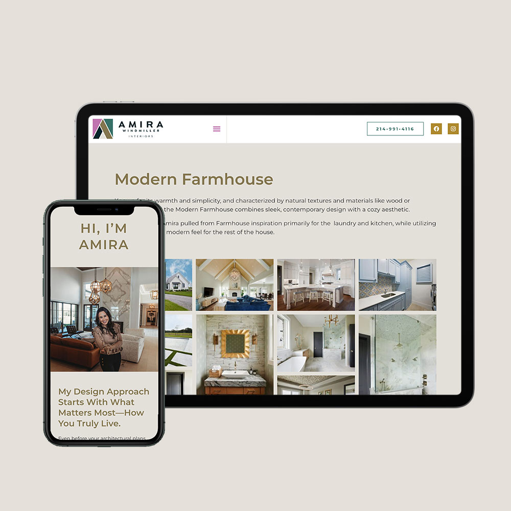
Amira Windmiller is kind of a big deal in the Fort Worth interior design world. After dipping her toe into the industry four years ago, she quickly rose to prominence, earning a reputation for transforming ordinary spaces into signature home experiences. It’s no surprise that Amira Windmiller Interiors landed the opportunity to design one of Fort Worth Magazine’s Dream Street Homes. The problem is her digital presence needed a bit of renovation itself. With only a few months left until the completion of the Dream Home, it was Ardent’s mission to design a website and logo that elevated her digital presence to match. As designers working with designers, we had the unique opportunity to stretch the envelope—just as Amira likes to do—with a bold, elegant, and modern website and logo design. We broke away from her logo’s old color scheme in favor of a vibrant and eclectic palette that better reflects her personal style. The website lets the photography of her finished interiors take the center stage with messaging alongside messaging that conveys her unique story and approach to design. Perhaps the most important page on the site, the gallery page, was built to be easily added to so that she could showcase new projects much more quickly than she previously could—giving potential clients the ability to imagine themselves in any space.

Alcon Medical Affairs came to Ardent Creative wanting a site that could stand on its own and highlight their efforts in science. This is the science arm of Alcon that handles medical grants, partners with healthcare professionals, and is a portal of information for people in the industry. We wanted this site to embody science and bring the feeling of discovery and awe with the use of textures and abstract elements.
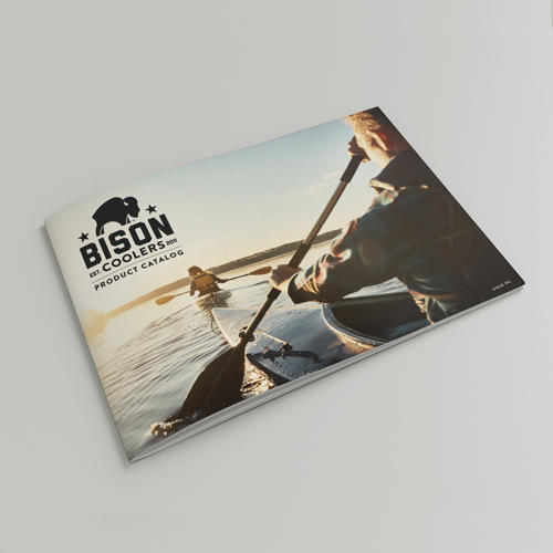
When conducting branding audits, we interview clients to reach a better understanding of their brand’s personality, its distinguishing factors, the company’s goals, and the desired target audience. After running an audit for Bison, the process revealed that the company had a strong desire to avoid blending in with the crowd. They also wanted to ensure they wouldn’t be known only as a hunting and fishing brand but, instead, as a brand that appealed to a wide variety of “Weekend Warriors.” They also wanted a voice that communicated quality, cost-effectiveness, and relatability.
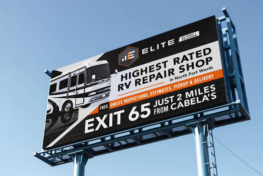
Elite RV was founded by experienced RV professionals who saw an outdated industry—one that lacked comprehensive service, specifically using technology to make things easier for the customer. They came to us seeking a brand identity that would differentiate them as a high-tech, customer-friendly authority in their industry. On the design side, we created a modern look utilizing black to keep things relatively minimal and clean paired with an accent color to differentiate services. A bold sans-serif type treatment further inspires the cutting-edge look. The content strategy behind the overall branding, website, digital marketing and sales collateral drove home the promise that Elite perfectly delivers a superior product while rolling out elite customer service. The result? Elite was so pleased with the work that they hired us to create a similar creative strategy for their secondary brand, Elite Auto.
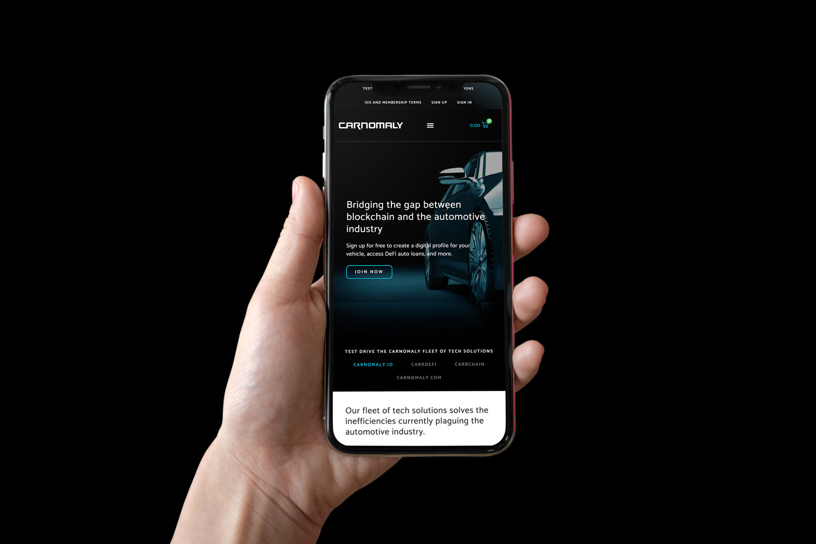
In their mission to bridge the gap between blockchain technology and the automotive industry, Carnomaly needed a brand identity that would speak to both crypto investors and automotive enthusiasts. Each of the three logo marks within the Carnomaly umbrella of services needed to harmonize with each other while establishing their own unique identity. A “dark mode” backdrop accented bright secondary hues of blue and green. Custom illustrations and iconography rounded out the brand’s sleek visual identity. Responsive web design and digital applications were the critical digital collateral that connected Carnomaly with early investors and crypto hobbyists interested in their emerging technology. Multichannel digital marketing strategy reached niche audiences on LinkedIn, Reddit, and Twitter and cultivated brand recognition during key development phases.
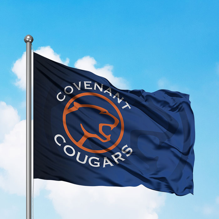
Covenant Christian Academy is a classical Christian private school in the DFW area. They partnered with us to create a new image campaign that showed how a Covenant education is a unique, life-altering experience for faith-first families. In fact, you could say their educational approach is “uncommon” in how the fundamental values of faith and love for God guide everything they do. Drawing from this unique differentiator, the “Un-” campaign was created to showcase the spirit of their school and boost them to top-of-mind for parents shopping for a private Christian education. Amid a sea of bland school messaging, the Un- campaign stood out proudly with the use of Covenant’s school colors—bold orange on a backdrop of blue. We ran multiple digital marketing campaigns for the school’s open houses and the athletics department utilizing the new branding strategy. To further capture the attention of potential families, we also directed and produced videos and photoshoots that simply told the story of Covenant Christian Academy—how being uncommon is actually excellent in a sea of sameness.
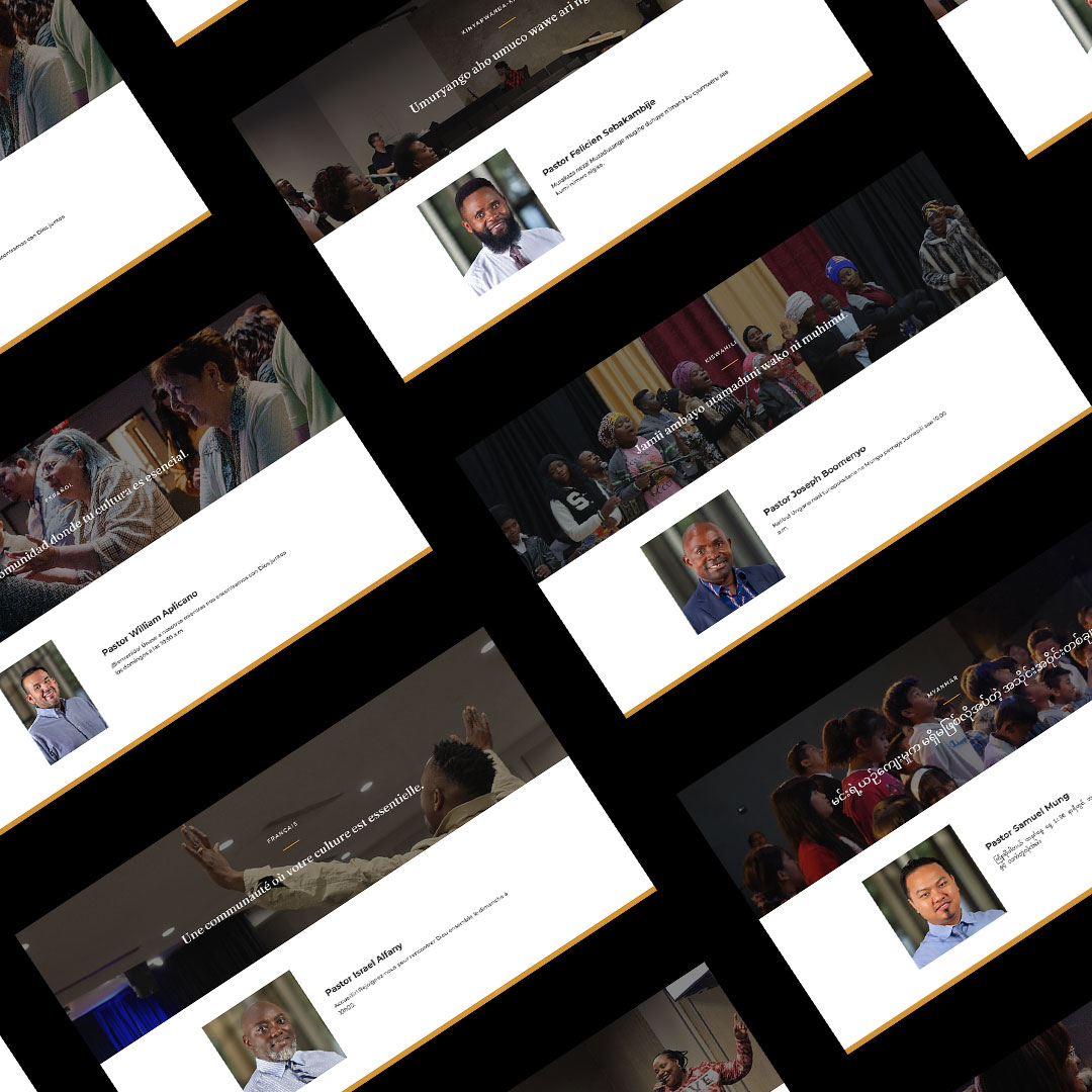
Long-standing clients hold a special place at Ardent Creative. Bethesda Community Church has worked with us on many projects over the years, and we were thrilled to collaborate on their newest endeavor. Bethesda Community Church is a vibrant fellowship of faith with a diverse congregation, offering worship services in six languages. However, their website wasn’t keeping pace with this remarkable diversity. Accessibility became a key concern — attendees needed a seamless online experience in their preferred language. Additionally, the logo felt dated and didn’t reflect the church’s vibrant spirit.
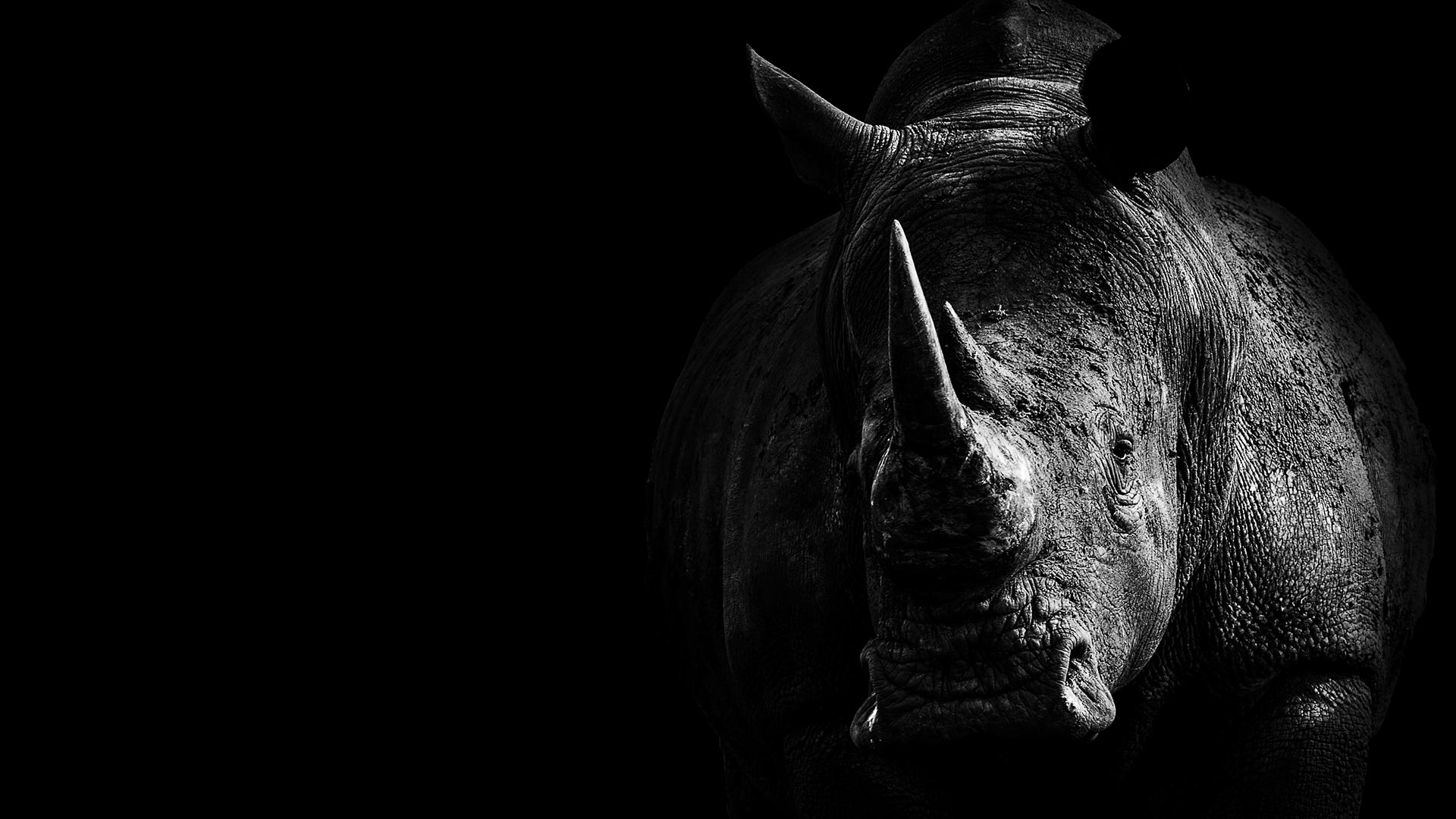
Rhino Health came to us in need for a complete rebrand and overhaul to prepare for a major growth period as they begin to establish themselves as the preeminent nitrile glove manufacturer in the US. We established a new brand that differentiates itself in the market and applied the brand across a new website and product line development. We then worked with their sales team to redevelop their sales presentation and packages to represent their values and position in the industry to potential customers.
We are proud of our great clients. Clients include TCU, Frank Kent, CrossFit DFW, Pizzeria Testa, Bison Coolers, WilliamsTrew, Fort Worth Dream Park, Samsung Networks, Red Bull, Union Gospel Mission, Gratitude Initiative, Alcon, Texas National Bank, Grace Prep, Nelson Forensics, TRWD, UTA.