The Anatomy of a Good Logo
The swoosh. The red target. The bitten apple. These company symbols are instantly recognizable to audiences everywhere. They evoke deep emotional responses in people all over the world, and are held up as the gold standard of logo design. They can also be seen as an impossible...
The swoosh. The red target. The bitten apple.
These company symbols are instantly recognizable to audiences everywhere. They evoke deep emotional responses in people all over the world, and are held up as the gold standard of logo design.
They can also be seen as an impossible achievement for companies without the resources of Nike, Target, or Apple. Smaller companies without teams of professional marketers consider it a pipe dream to have a logo that captures the essence of their business while being loved by consumers.
But it’s not.
Logo design has been the focus of so much study that savvy marketers and designers know the elements that make up a memorable, effective brand logo: typeface, icon design, color, and composition.
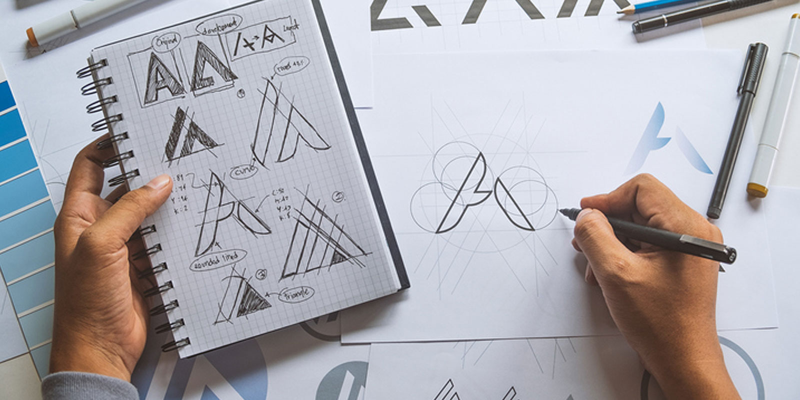
Like doctors who understand the purpose of every bone, organ, and artery inside a healthy body, graphic designers understand the importance of every design detail and how to utilize it to tell a brand’s story. Ardent Creative has used this knowledge to design effective logos for a variety of brands, carefully selecting every element to provide clients with the right logo that reflects who they are, their unique mission, and their place in the local or global community. Below, we point out specific details from each design to get a better understanding of the anatomy of a strong logo.
Let’s start dissecting.
Typeface
You may not have spent much time thinking about your emotional responses to fonts, but maybe you ought to. Fonts alone have the power to make your brand feel modern or classic, elegant or aggressive, serious or fun-loving. In fact, the font that you choose for your logo communicates more about who your company is than the meaning of the actual words.
(Did you know? A “serif” font includes a finishing stroke on each end of a letter’s stem (which is also referred to as the “foot” of the letter). That means that a serif font contains these serifs, whereas a sans serif font doesn’t.)
Often, serif fonts are seen as traditional, more conventional, or conservative. Sans serif fonts can give a more minimal, modern, and progressive vibe.
 For the Rightwise Prep logo, we used a softer serif typeface, a careful choice for an educational company. Thrivent focuses on preparing students to succeed in college and in their careers. Appropriately, Ardent utilized a serif font that reflects the brand’s academia, steadiness, and respectability.
Upon seeing the font, viewers have the idea that Thrivent is an intelligent, professional business with experience in their field. But the serif font is complemented with sans serif font for the smaller word “learning” to ensure attention is focused on the company’s unique name. The result is a clean, memorable, but simple impression. By taking advantage of the power of typeface, Thrivent’s logo successfully introduces itself to new customers.
For the Rightwise Prep logo, we used a softer serif typeface, a careful choice for an educational company. Thrivent focuses on preparing students to succeed in college and in their careers. Appropriately, Ardent utilized a serif font that reflects the brand’s academia, steadiness, and respectability.
Upon seeing the font, viewers have the idea that Thrivent is an intelligent, professional business with experience in their field. But the serif font is complemented with sans serif font for the smaller word “learning” to ensure attention is focused on the company’s unique name. The result is a clean, memorable, but simple impression. By taking advantage of the power of typeface, Thrivent’s logo successfully introduces itself to new customers.
Icon Design
Icons are the first things that come to mind when you talk about corporate logos. This is where Nike and Apple have pulled away from the pack, but it’s also where designers can make the most mistakes. Too many lazy restaurants have forks and knives in their logos, and too many lazy executives have approved logos with obviously confusing, muddled, or overly complicated images in them. A logo’s iconography is potentially its most memorable element. It deserves attention for the right reasons.
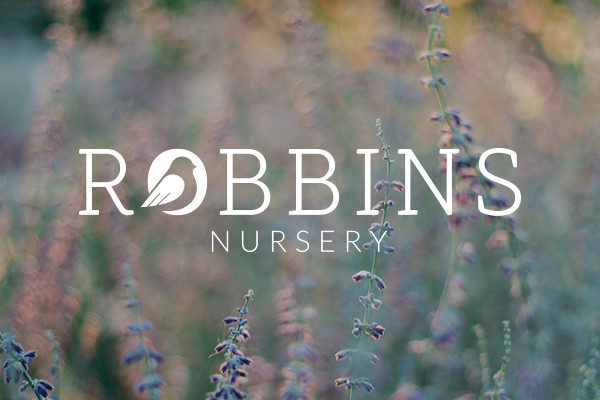 Company icons should be simple and easily recognizable. With one glance, an audience should be able to describe the symbol. Because your icon will become the representation of your company, it has to be versatile; usable in any medium and at any size.
The icon for Robbins Nursery, a Florida plant nursery, fits all of these criteria. Nestled in the “O” of the brand name, the bird pulls double duty as brand icon and artful letter. It is beautifully simple and is used in a variety of colors throughout the nursery. A bird icon is also highly appropriate for a natural company (and one that shares a name with a bird, for that matter) without being too on the nose. It is effective because of its simplicity and relevance.
Company icons should be simple and easily recognizable. With one glance, an audience should be able to describe the symbol. Because your icon will become the representation of your company, it has to be versatile; usable in any medium and at any size.
The icon for Robbins Nursery, a Florida plant nursery, fits all of these criteria. Nestled in the “O” of the brand name, the bird pulls double duty as brand icon and artful letter. It is beautifully simple and is used in a variety of colors throughout the nursery. A bird icon is also highly appropriate for a natural company (and one that shares a name with a bird, for that matter) without being too on the nose. It is effective because of its simplicity and relevance.
Color
If typeface and iconography are the bones of your logo, then color is the blood. It is what brings the logo to life and gives it eye-catching appeal. Color evokes more emotion than any other element in logo design. Every color has an associated feeling that it gives audiences, making color design immensely important to consider when deciding how you want to make customers feel.
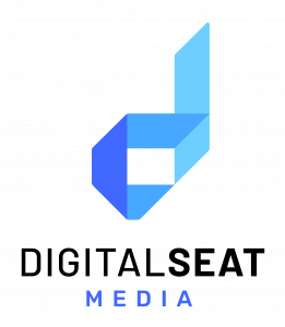 Digital Seat Media is a company that offers an improved version of QR codes, allowing users to scan digital seat tags with their mobile phones to access personalized content without the use of an app.
This technological company needed a logo that felt modern and high-tech. The modern font and sleek dimensional icon in the logo help shape the brand identity, but the color pallet solidifies it. Blues communicate intelligence and confidence while also having a calming effect. The logo’s color range encourages the audience to trust Digital Seat Media and rely on their expertise.
At its first impression, Digital Seat’s brand feels innovative, agile, and like they can depend on the company, and it is largely due to the logo’s color scheme.
Digital Seat Media is a company that offers an improved version of QR codes, allowing users to scan digital seat tags with their mobile phones to access personalized content without the use of an app.
This technological company needed a logo that felt modern and high-tech. The modern font and sleek dimensional icon in the logo help shape the brand identity, but the color pallet solidifies it. Blues communicate intelligence and confidence while also having a calming effect. The logo’s color range encourages the audience to trust Digital Seat Media and rely on their expertise.
At its first impression, Digital Seat’s brand feels innovative, agile, and like they can depend on the company, and it is largely due to the logo’s color scheme.
Composition
But to make all of these design elements most effective, they must be composed into a single unified scheme. The composition of all these details has the ability to make your logo fly off the screen (or feel awkward) to the audience. To have a healthy, effective logo, you must understand how the parts work together.
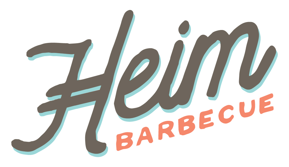 The Heim Barbecue logo is an example of a well-composed combination of the different design elements.
The design prominently displays the custom font. The highly decorative “H” is the focal point, functioning as the de facto brand icon. The gray-brown, coral, and turquoise blue hues are friendly and casual. Both words are in eye-pleasing alignment and the slight tilt of the design makes the restaurant feel personal and local.
Together, the sum of all the logo parts creates a memorable impression that relays Heim’s story of loveable, homemade Texas barbecue.
The Heim Barbecue logo is an example of a well-composed combination of the different design elements.
The design prominently displays the custom font. The highly decorative “H” is the focal point, functioning as the de facto brand icon. The gray-brown, coral, and turquoise blue hues are friendly and casual. Both words are in eye-pleasing alignment and the slight tilt of the design makes the restaurant feel personal and local.
Together, the sum of all the logo parts creates a memorable impression that relays Heim’s story of loveable, homemade Texas barbecue.
Finding the right logo design for your company is not impossible.
You don’t have to wait for your logo to appear in a vision or take shape in your espresso foam. The fact is: logo design is as much science as it is art. Knowing what to use, where to use it, and how, is the key to a logo that hits its mark.
If you want an artfully engineered logo for your company, contact Ardent Creative. We can design a simple, recognizable, and compelling logo that captures your brand identity and connects you with potential customers. Contact Ardent