The new Man of Steel movie, Superman, drops July 11 and fans are giddy to see Clark Kent throw off his glasses and exchange his nice guy persona for a cape and tights to yet again save the day. As marketers, we are also giddy to see how the style of this new movie’s branding plays out.
If you were to study the Superman logo over the years, you’d realize that the brand—and that iconic symbol—has evolved over the years, shifting with the changing times.*
The creative force behind DC Studios, James Gunn, revealed a new design exactly one year prior to the movie’s highly anticipated theatrical release date. An updated take on the iconic “S” shield might look like a minor tweak to casual fans but to anyone paying attention (and you better bet our designers noticed), it said something bigger:
Superman’s story isn’t just evolving. Superman’s brand, it is a-changing.
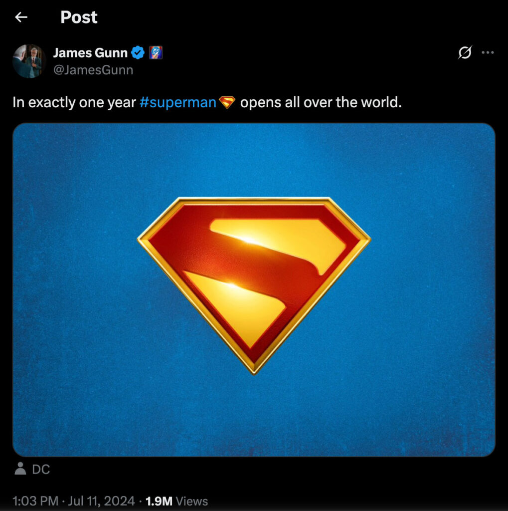
Source: @JamesGunn
That symbol has carried a lot of meaning over the past 85 years for those who grew up with Superman.
Superman isn’t just an “S” on a shield: it’s the embodiment of truth, justice, and the simple notion of doing what’s right. It’s a brand story that resonates through generations.
Not one to give up on a creative challenge, we thought we’d take a quick fly-through of how the Superman logo has evolved over the decades.
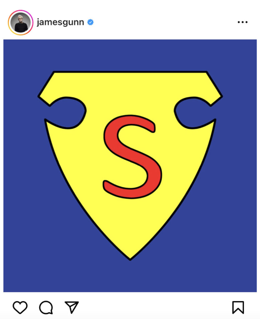
Source: @JamesGunn
Let’s Talk Origin Story: 1938
Superman made his debut in Action Comics #1, thanks to creators Jerry Siegel and Joe Shuster. This origin logo was more crude than iconic with a pretty basic “S” on what appears to be a police badge. Superman at this moment was still finding his footing; he was more strong man than a superhero. Side note: We are kinda wondering why James Gunn posted this on his IG. Is he hinting at a throwback within the new movie? Will we see this vintage logo return? Hmm… time will soon tell.
Marketing Note: Early-stage branding can be messy without a solid creative plan, so stay the course.
Source: Wikimedia
Superman Gets Jacked: 1940
Around Action Comics #26 and Superman #4, the logo started to level up. Superman was getting jacked—his character gained more confidence and that logo finally beefed up. The “S” got bigger, bolder and began shifting into the diamond-shaped shield we now associate with the Man of Steel. It still wasn’t totally consistent (comic artists were still doing their own thing), but the visual identity was starting to stick.
Marketing Note: Brand evolution often happens in iterations. You don’t always land the perfect mark right away but each version can move you closer.
Source: CBR
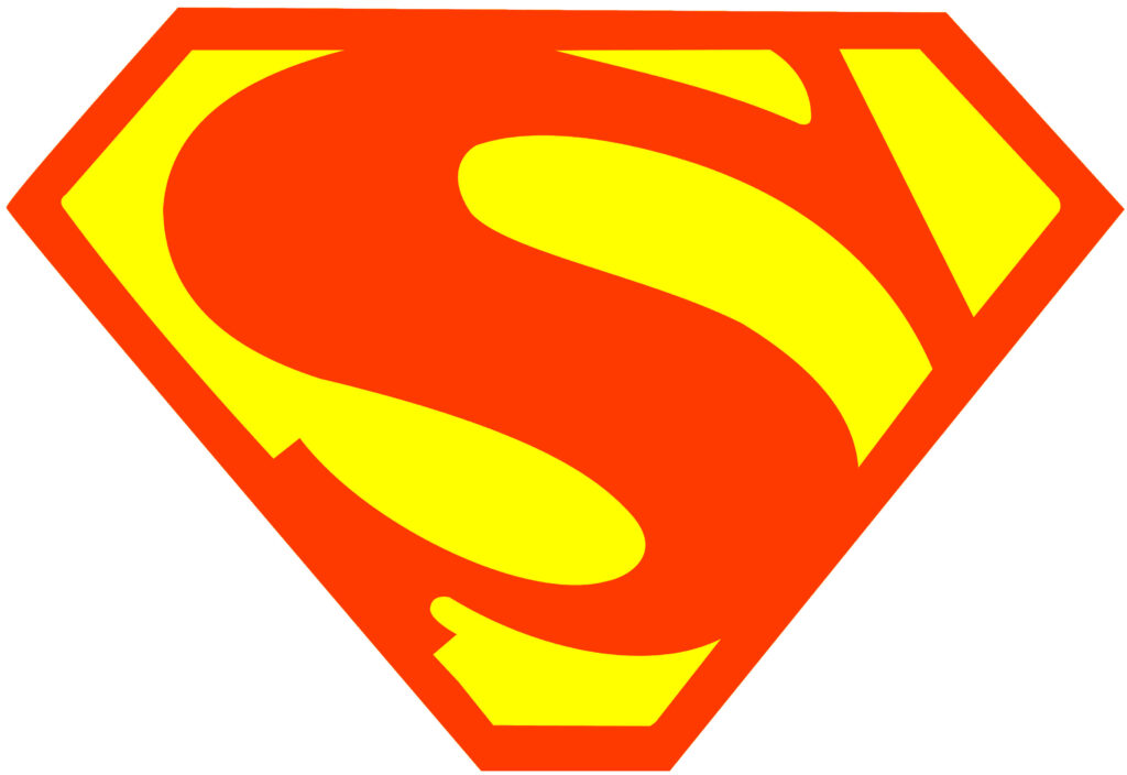
Fleischer Era Fandom: 1941
According to the fandom forums, the Max Fleischer animated shorts gave Superman his lore and was largely considered the Golden Age. Although there is much disagreement among super fans, many would say this was the first time that iconic red “S” consistently appeared inside a sharp, diamond-shaped shield.
Also this where the logo gets a bit gritty—the logo gets a dark mode. We see the infamous “S” appear on a black background. This grit influences the character of Superman and we see him more resilient and determined according to fans. What we loved about this darker take: the colors popped, the lines tightened, and the “S” finally looked ready to be unveiled to a waiting world. For many, this was the moment the logo became unforgettable.
We’re not saying it’s the exact look Gunn’s going for in Legacy, but if you squint at the modernized logo…we see echoes.
Marketing Note: Consistency builds recognition. The moment you tighten up your brand’s visual identity, the audience starts to demand your name.
Source: Wikipedia
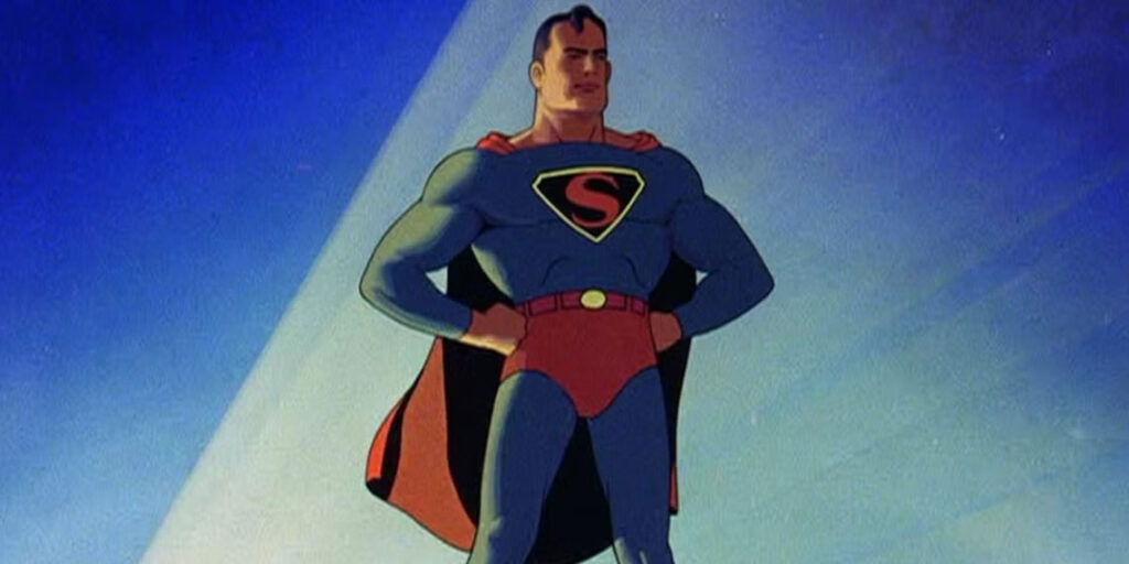
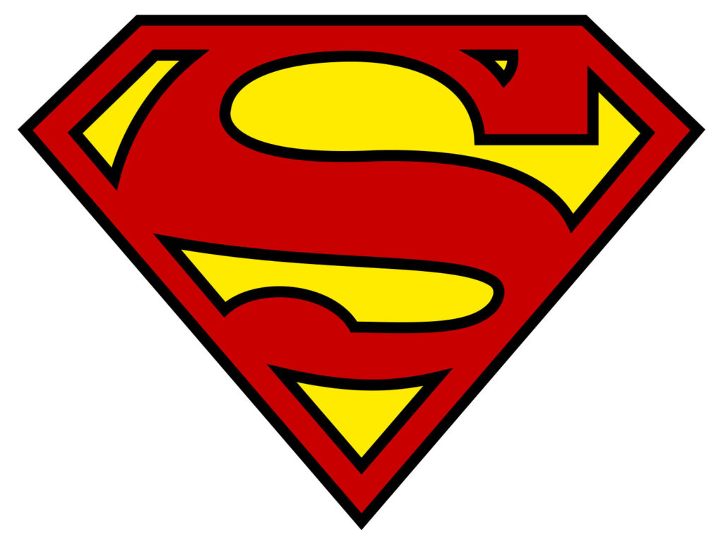
The Super Standard Is Set: 1977–Today
It wasn’t until 1977–78, with the release of Superman: The Movie starring Christopher Reeve, that the logo truly locked into the clean, diamond-shaped design we know and love today. This version became the gold standard, setting the tone for everything that followed.
From cereal boxes to lunchboxes to blockbuster films, this shield became the face of Superman for generations. Even through modern updates and darker reboots, most designs have traced their roots back to this one.
Marketing Note: Consistency builds legacy but it starts with a version worth sticking to.
What This Means for Marketers
Superman’s logo is one of the most enduring brand marks of all time. What we personally love as marketers is how every creative team over the years put their own spin on it—reimagining what Superman needed to be for their own generation.
A few takeaways:
- Strong brands evolve, but they never lose their core identity.
- Symbols matter more than ever in a visual-first, Instagram-worthy world.
- Consistency creates trust but only if you’ve done the work to define what you stand for.
- Trust real artists and storytellers to bring your brand story to life because AI cannot capture the human heart behind it all.
Every Brand Has Its Kryptonite—Let’s Fix That
When we set out to write about Superman and his trusty logo, this wasn’t just about superhero nostalgia. This was about identifying branding that lasts.
Every brand has its kryptonite. We get that! But we can help you get past yours with bold strategy, sharp design, and a story that actually sticks.
Reach out, and let’s build something bold.
*The Superman logo and all related characters and elements are trademarks of and © DC Comics/Warner Bros. Discovery. Used here for illustrative and educational purposes only.